Infotainment System
Next-gen in-vehicle infotainment balancing safety with intuitive controls.
Safety Meets Intuition
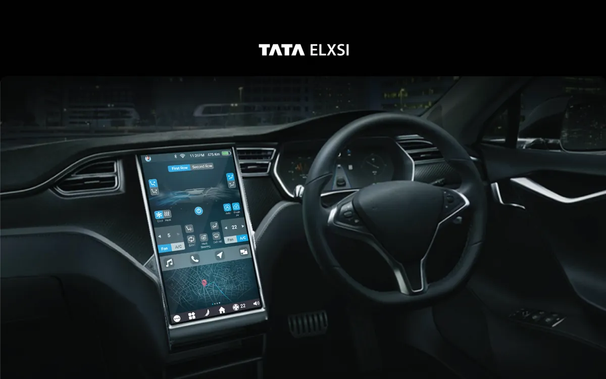
The infotainment system represents the primary touchpoint between driver and vehicle. We designed a next-generation interface that balances feature richness with safety-first principles. Navigation, media, climate control, phone integration, and vehicle settings are all accessible through a layered interaction model that ensures essential controls are always within one tap, while secondary features are neatly organized behind a single level of navigation. The dark-mode-first design reduces eye strain and glare during night driving.
The Challenge
Automotive HMI design must work at a glance — drivers can't afford the cognitive load of complex interfaces. Existing systems were either too simple, missing features users expected from their smartphones, or too complex, creating dangerous distractions. The interface needed to serve both tech-savvy drivers who want full control and those who just want music and navigation without complexity. NHTSA guidelines mandate strict limits on glance time and interaction depth.
How We Approached It
Safety Standards Research
We studied automotive safety standards including NHTSA visual-manual guidelines, which specify maximum glance times of 2 seconds and total task times of 12 seconds. We analyzed competitor infotainment systems from BMW iDrive, Tesla's touchscreen, and Mercedes MBUX to identify what works and what creates dangerous distractions. This research established our interaction budget for every feature in the system.
Layered Interaction Model
We designed a layered interaction model where essential controls — volume, navigation, climate — are always visible on the home screen. Secondary features are behind exactly one tap, never more. The layout uses large touch targets (minimum 44px) with generous spacing to prevent mistouch. Contextual controls appear based on driving state: media controls expand when audio is playing, navigation simplifies during active routing.
Simulator Testing
We built prototypes and tested them in driving simulators, measuring glance time, task completion time, and lane deviation for every interaction. The simulator sessions revealed that icon-only interfaces caused more cognitive load than icon+label combinations, and that bottom-of-screen placement reduced glance distance from the road. We iterated through 4 major design revisions based on simulator data.
Adaptive UI System
We created an adaptive UI that simplifies based on driving speed and conditions. At highway speeds, the interface automatically reduces to essential controls with larger touch targets and higher contrast. In parking or stationary mode, the full feature set is available. This speed-responsive design ensures safety without permanently limiting the system's capabilities, giving drivers full access when it's safe to use.
What We Delivered
A production-ready infotainment interface that meets NHTSA safety guidelines while delivering a feature-rich experience. The layered interaction model keeps essential controls always accessible, the adaptive UI simplifies at speed, and the dark-mode-first design reduces nighttime glare. Every interaction was validated through driving simulator testing.
What Makes It Stand Out
Glance-optimized UI
Large touch targets and high-contrast elements designed for 2-second glance times.
Adaptive Complexity
Interface simplifies at highway speeds and expands features when stationary.
Voice Control Integration
Natural language voice commands for hands-free control of all major functions.
Navigation Integration
Seamless turn-by-turn navigation with predictive routing and live traffic overlay.
Media Controls
Contextual media interface supporting streaming, radio, and Bluetooth sources.
Vehicle Settings Hub
Centralized vehicle configuration for lighting, seats, mirrors, and driving modes.
Design Highlights