Expanding Adda247's reach to Apple users with a native iOS and iPad experience designed with platform-specific conventions and seamless cross-device continuity.
Adda 247's platform was primarily Android-focused, leaving approximately 30% of their target audience — Apple device users — without a native app experience. The mobile web experience on Safari was suboptimal, with layout issues, poor offline support, and missing platform-native interactions that iOS users expect. We designed a native iOS and iPad application that brings the complete Adda247 learning experience to Apple devices while respecting platform conventions and leveraging unique Apple capabilities like Handoff, Widgets, and Split View.
30% of the target audience used Apple devices but had no native app. These were often premium users — working professionals preparing for competitive exams — who were willing to pay for quality content but were frustrated by the suboptimal mobile web experience. The Safari-based experience suffered from inconsistent layouts, no push notifications for class reminders, and zero offline capability — critical for students who studied during commutes.
Simply porting the Android app to iOS would have been a mistake. iOS users have different expectations around navigation patterns (tab bars vs. hamburger menus), gesture interactions (swipe-to-go-back), and visual design (blur effects, SF Symbols). A direct port would feel foreign and cheap to Apple users accustomed to polished, platform-native experiences. We needed to rethink the entire interaction model while maintaining feature parity and brand consistency.
The iPad presented an additional challenge — and opportunity. Many students used iPads as their primary study device, and the larger screen could support split-view layouts, Apple Pencil annotations, and side-by-side multitasking that would significantly enhance the study experience. But this required designing entirely new layouts, not just scaling up the phone interface.
We conducted a thorough analysis of iOS user behavior patterns and Apple Human Interface Guidelines. We audited 12 top-rated iOS education apps to understand what "feels native" on Apple platforms. User interviews with 40 iOS users revealed that they expected swipe gestures, haptic feedback, and seamless iCloud sync as baseline features. We also analyzed device usage data showing that 35% of iOS users owned both an iPhone and iPad, making cross-device continuity a critical requirement.
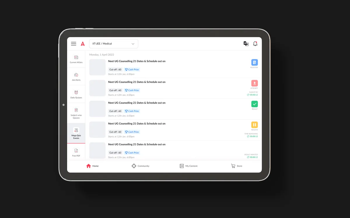
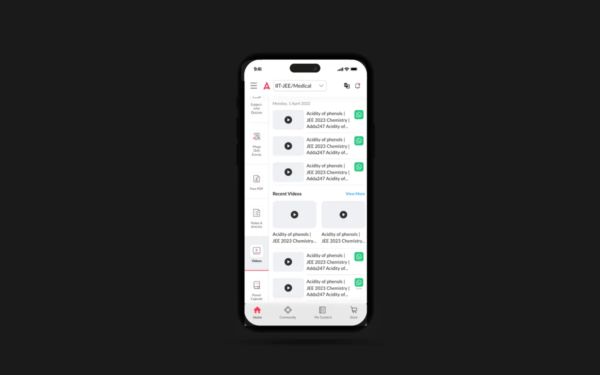
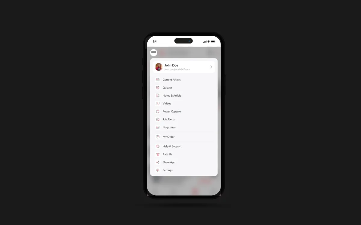
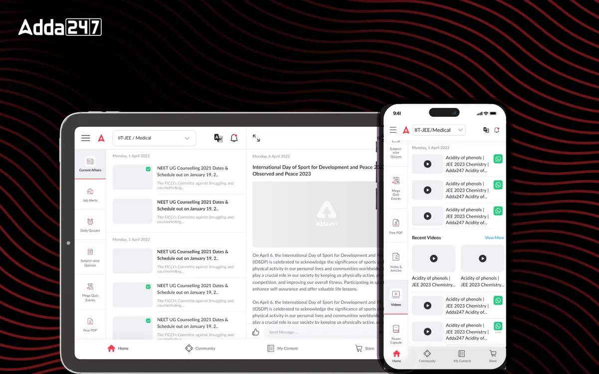
We adapted the existing information architecture for iOS navigation patterns — replacing the Android drawer navigation with a tab bar for primary sections, implementing large title headers with scroll collapse, and using iOS-native sheet presentations for secondary flows. The iPad IA introduced a sidebar-based navigation that transforms into a split-view layout, allowing students to browse courses in one panel while reading content in another. We mapped every Android screen to its iOS equivalent, identifying 15 screens that needed entirely new layouts.
We created platform-specific prototypes respecting iOS conventions while maintaining brand consistency. Key decisions included adopting SF Symbols throughout the interface, implementing native iOS blur effects for overlays, and using iOS-standard action sheets instead of custom bottom drawers. The iPad prototype featured a dedicated split-view test experience where the question appears on one side and the question palette on the other. We tested both iPhone and iPad prototypes with 25 users, iterating on gesture-based navigation and the sidebar collapse behavior.
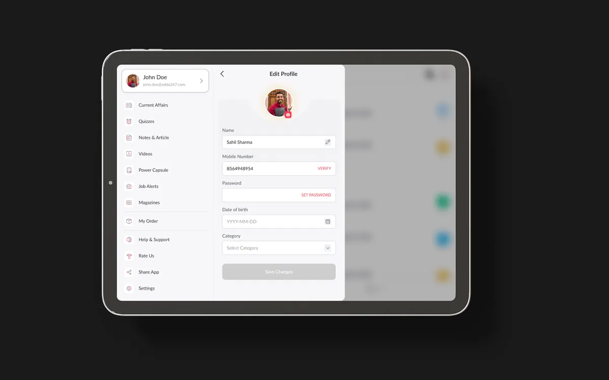
We built a comprehensive iOS design system with SF Symbols, native components, and Apple-specific interaction patterns. The visual language maintained Adda247's brand colors and typography hierarchy while adapting to iOS conventions — using Apple's standard corner radii, shadow styles, and animation curves. The design system included 80+ iOS-specific components, supporting both light and dark mode. Handoff included SwiftUI-ready specifications, asset catalogs, and accessibility annotations for VoiceOver support across all 65 screens.
A native iOS and iPad application that feels like it was built by Apple themselves. The iPhone app uses a tab-bar-first navigation with fluid swipe gestures, haptic feedback on interactions, and native iOS animations. The iPad version leverages the larger screen with split-view layouts for test-taking, picture-in-picture for live classes, and Apple Pencil support for annotating study materials.
Cross-device continuity through Handoff means students can start a test on their iPhone during a commute and seamlessly continue on their iPad at home. Home screen widgets surface upcoming classes and study streak data. Offline mode downloads courses, tests, and study materials for uninterrupted learning anywhere. The app supports both light and dark mode with automatic switching based on system preferences.
Tab bar navigation, swipe-to-go-back, large title headers with scroll collapse, and iOS-native sheet presentations — every interaction feels platform-native.
Dedicated iPad layouts with sidebar navigation, split-view test experience, and multitasking support — turning the iPad into the ultimate study companion.
Download courses, tests, and study materials for offline access. Smart storage management suggests what to keep based on upcoming exams and study schedule.
Start studying on your iPhone during commute and seamlessly continue on iPad at home. Progress, bookmarks, and test state sync instantly via iCloud.
Home screen widgets showing upcoming classes, study streak, and daily practice reminders — keeping exam preparation visible and top-of-mind throughout the day.
iPad users can annotate PDFs, mark up solutions, and take handwritten notes directly within the app — bridging the gap between digital and physical study methods.