 Let's Chat!
Let's Chat!
Let's Chat!
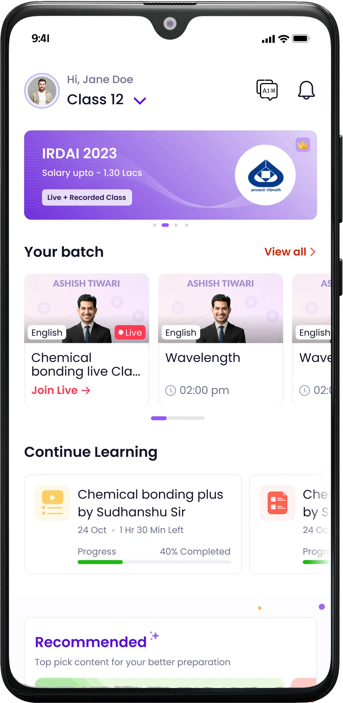
Transforming the home screen for IIT/JEE aspirants from a low-engagement feed to a value-driven hub that drives feature discovery and conversion.
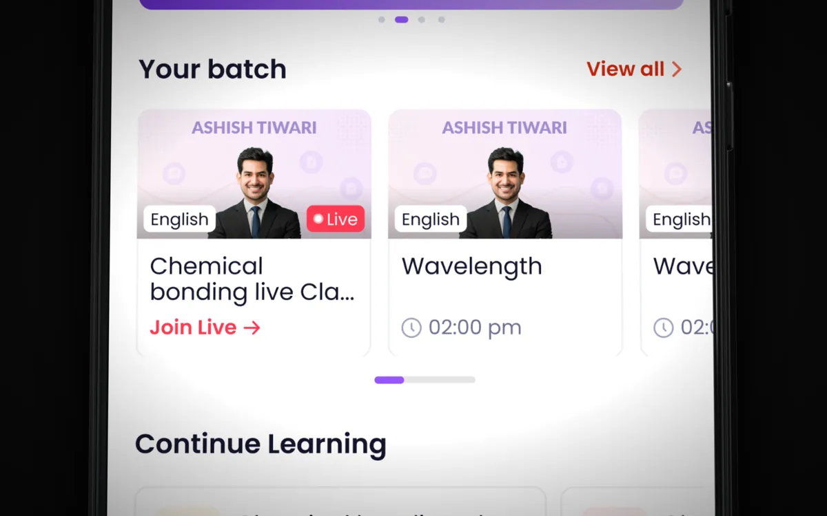
The Sankalp Bharat app served IIT/JEE aspirants — one of the most competitive and motivated student segments in India. Despite having excellent content and features, the app's home screen was a generic content feed that failed to surface the platform's most valuable features. Students opened the app, scrolled aimlessly, and closed it without taking meaningful action. We redesigned the entire home screen experience to create a value-driven hub that immediately surfaces progress, personalized recommendations, and quick-access tools that drive daily engagement and conversion from free to paid tiers.
The feed-based home screen was showing critically low engagement. Heatmap analysis revealed that 70% of users never scrolled past the first fold. The content being shown was generic — the same feed for a first-time user and a returning student preparing for an exam next week. High-value features like mock tests, personalized study plans, and performance tracking were buried 3-4 taps deep in the navigation, making them effectively invisible to most users.
Conversion from free to paid was particularly poor. Free users had no visibility into what premium features offered because those features were hidden behind navigation layers. Students would use the free content, hit a paywall on a random feature, feel frustrated, and leave. There was no structured journey from "discovering value" to "wanting more" to "upgrading." The business was losing potential revenue from a highly motivated, exam-deadline-driven audience that was willing to pay for quality preparation tools.
Daily active usage was also declining. Without personalized, actionable content on the home screen, students had no reason to open the app daily. Competitor apps with better home screen experiences were capturing attention and building stronger daily habits — a critical advantage in the exam preparation space where consistency beats intensity.
We analyzed heatmaps and session recordings of 10,000+ users over a 30-day period. The data painted a clear picture: users spent an average of 8 seconds on the home screen before either scrolling once or navigating away. We identified that 70% never scrolled past the first fold, and the features with highest engagement (mock tests, performance tracking) had the lowest discoverability. We also conducted 25 user interviews to understand what students wanted to see the moment they opened the app — the overwhelming answer was "my progress and what I should study next."
We redesigned the home screen IA to surface high-value content above the fold using a modular block system. The first fold was divided into three priority zones: (1) personalized study progress and streak data, (2) quick-launch buttons for mock tests and live classes, and (3) a "recommended for you" section driven by exam date proximity and weak areas. Below the fold, we organized content into contextual sections — upcoming exams, trending practice sets, and community highlights — each designed to drive a specific action rather than passive scrolling.
We designed three distinct home screen layouts and A/B tested each with 5,000 users over two weeks. Layout A was a dashboard-style grid with progress widgets. Layout B used a vertically stacked card system with personalized content. Layout C combined a progress header with a smart content feed. Layout A won in terms of feature discovery (+55%), but Layout C had higher daily return rates (+40%). We created a hybrid approach combining A's progress widgets with C's smart feed, which outperformed both in the final round of testing with another 5,000 users.
The winning layout was refined with micro-interactions and personalized content blocks. We added subtle animations for streak celebrations, progress milestones, and exam countdown urgency. The visual hierarchy used color intensity to draw attention to actionable items — bright, saturated colors for CTAs and muted tones for informational content. The handoff included 18 screens covering all personalization states, empty states, and first-time user onboarding flows, along with detailed specifications for the recommendation algorithm's UI behavior.
A value-driven home screen that acts as a personalized command center for exam preparation. The moment students open the app, they see their study streak, progress toward daily goals, and a smart "What to study next" recommendation based on their exam date, weak areas, and recent performance. Quick-access buttons provide one-tap entry to mock tests, live classes, and bookmarked content — eliminating the navigation depth that was hiding these features.
The personalization engine adapts the home screen based on where the student is in their preparation journey. Early-stage students see content discovery and study plan setup. Mid-stage students see progress tracking and practice recommendations. Final-stage students (close to exam date) see intensive revision tools, previous year papers, and confidence-building features. This dynamic adaptation ensures the home screen stays relevant throughout the entire preparation lifecycle.
AI-driven daily study plan based on exam date, syllabus coverage, and weak areas — turning overwhelming syllabi into manageable daily tasks.
At-a-glance progress visualization showing syllabus coverage, test scores trend, and study streak — motivating consistent daily preparation.
One-tap access to topic-wise tests, full mock tests, and daily practice sets — eliminating the navigation depth that was hiding core features.
A rotating daily challenge featuring 10 curated questions based on weak areas, with streak tracking to build consistent practice habits.
Set and track exam-specific goals — target scores, daily study hours, questions per day — with visual progress and milestone celebrations.
Anonymous peer comparison showing where the student stands relative to others preparing for the same exam, driving healthy competition.