Truenorth Analytics
Analytics and reporting interface for sales performance insights.
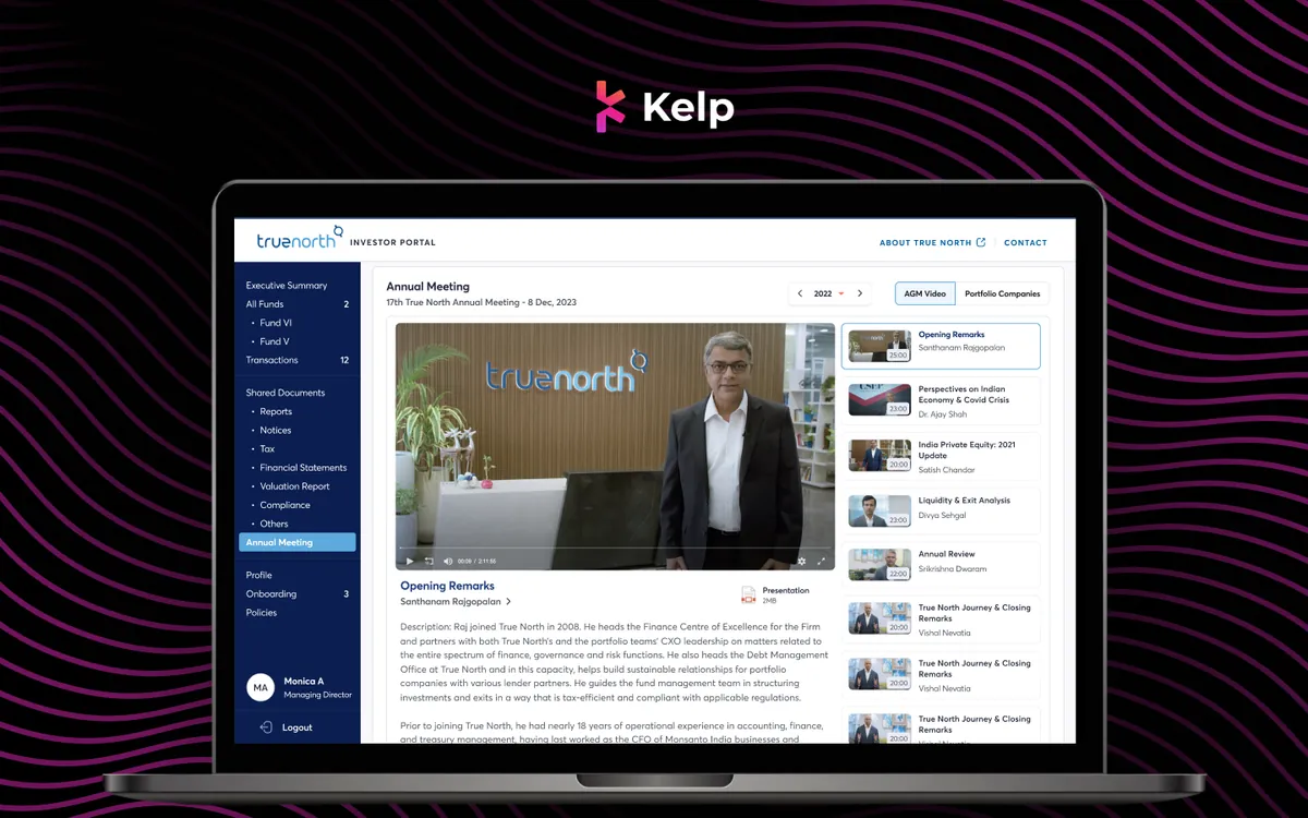
Sales Insights, Visualized
Truenorth is the analytics engine behind Kelp Global — a comprehensive reporting interface that transforms raw sales data into actionable insights. We designed a dashboard hierarchy that takes sales managers from a 30,000-foot team overview down to individual rep performance and deal-level analytics. The visualization system was built to support multiple sales methodologies and custom KPIs, ensuring the tool adapts to each team's unique workflow.
The Challenge
Sales managers had data scattered across spreadsheets, CRM exports, and email threads, but no unified view of team performance. Weekly reviews took hours of manual data compilation — time that should have been spent coaching reps and strategizing. The analytics tool needed to automate reporting while being flexible enough to support different sales methodologies from MEDDIC to Challenger Sale.
How We Approached It
Manager Interviews
We interviewed 15 sales managers about their reporting needs and pain points, discovering that most spent 3-4 hours every Monday morning compiling data for weekly team reviews. We mapped the questions they asked most frequently — "Who's behind quota?", "Which deals are at risk?", "Where are the coaching opportunities?" — and designed the dashboard to answer these questions at a glance without any manual data wrangling.
Dashboard Hierarchy
We designed a three-level dashboard hierarchy: team overview for executive visibility, individual performance cards for manager coaching, and deal-level analytics for pipeline management. Each level was designed as a complete view that stands on its own, while drill-down paths connect the levels seamlessly. The hierarchy mirrors how managers naturally think about their teams — from forest to trees to leaves.
Visualization Prototyping
We built interactive chart prototypes testing different visualization approaches for pipeline data, quota attainment, and forecast accuracy. We tested bar charts vs. radial charts for quota tracking, Sankey diagrams vs. funnels for pipeline flow, and sparklines vs. full charts for trend data. User testing revealed that simpler visualizations consistently outperformed complex ones for quick decision-making.
Customizable Templates
We created customizable dashboard templates for different sales methodologies — MEDDIC, BANT, Challenger Sale, and custom frameworks. Each template pre-configures the metrics, stages, and health indicators that matter most for that methodology. Managers can also build custom dashboards with a drag-and-drop widget system, ensuring the tool adapts to any team's process rather than forcing a one-size-fits-all approach.
What We Delivered
A multi-level analytics dashboard that automates weekly reporting and surfaces coaching opportunities through intelligent visualizations. The template system supports multiple sales methodologies while the drill-down hierarchy gives managers visibility from team-level to individual deal-level with seamless navigation.
What Makes It Stand Out
Team Overview Dashboard
Executive view of team performance, quota attainment, and pipeline health.
Individual Performance Cards
Rep-level scorecards with trends, coaching insights, and activity metrics.
Pipeline Visualization
Interactive funnel and flow diagrams showing deal progression and bottlenecks.
Forecast Accuracy Tracker
Historical forecast vs. actual comparison with confidence scoring.
Custom Report Builder
Drag-and-drop widget system for building methodology-specific dashboards.
Automated Weekly Digest
AI-generated summary emails with key insights and action items.
Design Highlights