 Let's Chat!
Let's Chat!
Let's Chat!
Comprehensive analytics dashboard providing actionable insights into test performance, content consumption, and personalized improvement paths.
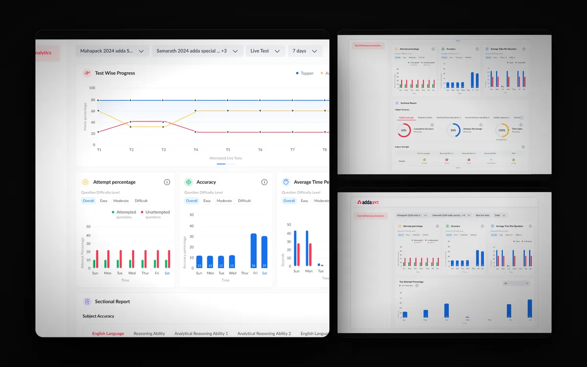
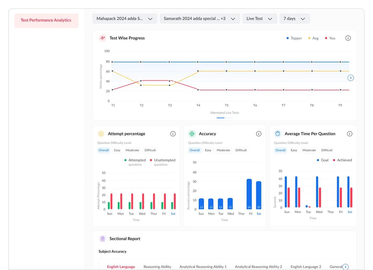
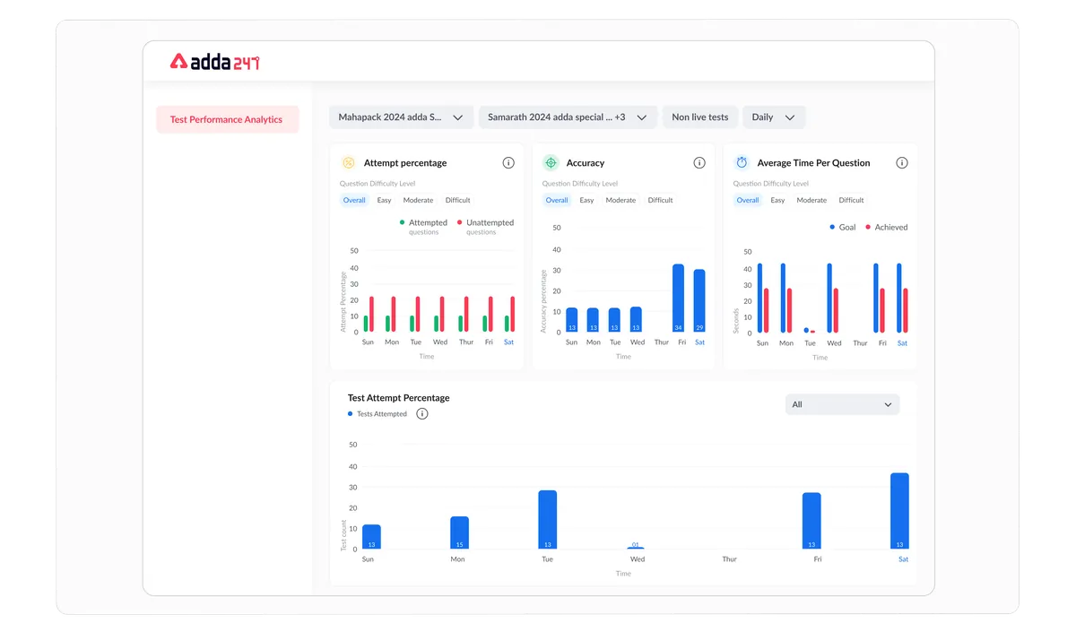
Adda 247 generates enormous amounts of data about student performance — test scores, time spent per question, topic-wise accuracy, comparison with peers, and content consumption patterns. But this data was either invisible to students or presented in basic tables that required significant effort to interpret. We designed a comprehensive performance dashboard that transforms raw data into actionable insights, helping students understand not just how they performed, but what to do next to improve. The goal was to make data the foundation of every study decision.
Students had no visibility into their overall performance trends. After completing a test, they saw a score and a rank — nothing more. There was no way to understand which subjects were improving, which were declining, or how their performance compared to peers over time. Without trend data, students couldn't tell if their preparation strategy was working or if they needed to change approach. They were essentially studying blind, relying on gut feeling rather than data.
Identifying weak subjects was particularly painful. Students had to manually recall their scores across multiple tests, mentally calculate topic-wise averages, and try to spot patterns — an exercise that was both tedious and unreliable. Even motivated students rarely did this analysis, which meant they kept making the same mistakes in the same topics without realizing the pattern. The irony was that the platform had all this data but wasn't surfacing it in a useful way.
Study time was being spent inefficiently as a result. Without data-driven guidance, students defaulted to comfortable patterns — studying subjects they enjoyed rather than subjects they needed to improve. Research shows that targeted practice on weak areas is 3-5x more effective than general practice, but students had no tool to identify those weak areas. The platform was sitting on a goldmine of performance data that could dramatically improve student outcomes — it just needed to be designed into an accessible, actionable interface.
We analyzed what data points matter most to competitive exam students by interviewing 40 students across different performance levels — toppers, average performers, and struggling students. Top performers wanted detailed topic-level breakdowns and time analysis. Average performers wanted to know where they stood relative to peers and what to focus on. Struggling students wanted simple, clear guidance on what to do next without being overwhelmed by data. We also interviewed 10 coaching institute teachers to understand which metrics they tracked for their students — accuracy by difficulty level, speed vs. accuracy trade-offs, and consistency across test attempts.
We designed a data hierarchy with four levels of progressive detail: (1) Overview — a single-screen summary with overall score trend, strengths, weaknesses, and a "focus area" recommendation, (2) Subject Level — per-subject performance with accuracy, speed, and improvement trends, (3) Topic Level — granular topic-by-topic breakdown with question-type analysis, and (4) Question Level — individual question review with time spent, correct answer, and explanation. Each level could be reached from the previous one through intuitive drill-down — tap a subject card to see topics, tap a topic to see questions. This progressive disclosure ensured the dashboard served both quick-glancers and deep-analysis users.
We created interactive chart prototypes and tested data visualization approaches with 50 students. We tested line charts vs. bar charts vs. radar charts for subject comparison — radar charts won because they showed the "shape" of performance across all subjects at once, making imbalances immediately visible. For trend analysis, simple line charts with clear up/down indicators performed best — students didn't need complex statistical visualizations, they needed to know "am I improving or not?" We tested three overview layouts: score-centric, improvement-centric, and action-centric. The action-centric approach — which led with "what to focus on next" rather than just showing data — had the highest engagement and follow-through rate.
We built a responsive dashboard with progressive disclosure — simple overview first, detailed analysis on demand. The visual language used a consistent color system: green for strengths, red for weaknesses, blue for neutral data, and purple for recommendations. Chart designs were deliberately simplified — no unnecessary grid lines, minimal axis labels, and prominent data points that convey the story at a glance. Animation was used purposefully: score trend lines animate on load to draw attention to the direction of change, and drill-down transitions use expand animations that maintain spatial context. We delivered 32 screens covering all data states, empty states (for new users with insufficient data), and responsive layouts for mobile, tablet, and desktop.
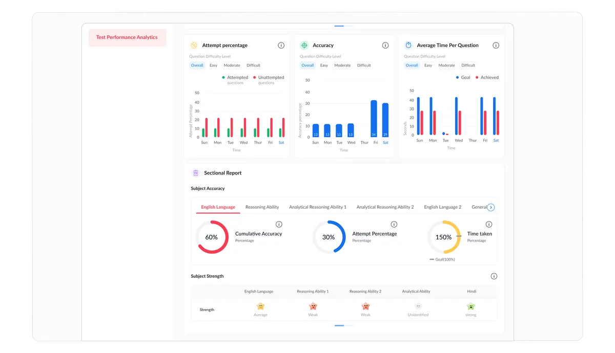
A comprehensive analytics dashboard that transforms raw test data into personalized, actionable study guidance. The overview screen presents a "Performance Score" — a composite metric that combines accuracy, speed, consistency, and improvement trend into a single number that students can track over time. Below this, a radar chart shows subject-level performance balance, and a "Focus Area" card highlights the single most impactful topic to study next based on algorithmic analysis of the student's performance patterns.
Drilling deeper, the subject-level view shows accuracy and speed trends over the last 10 tests, topic-wise breakdown with performance indicators, and peer comparison for that subject. The topic-level view reveals question-type analysis (e.g., in Mathematics: are you struggling with word problems specifically?), time analysis (which topics eat disproportionate time?), and a curated practice set of questions targeting identified weak patterns. The dashboard becomes a study strategist — not just reporting what happened, but recommending what to do about it.
A composite metric combining accuracy, speed, consistency, and improvement trend — providing a single trackable number that captures overall preparation quality.
Radar chart visualization showing performance balance across all subjects, with drill-down into topic-level accuracy, speed, and improvement trends.
Performance trend lines across the last 10-20 tests with clear up/down indicators — answering the crucial question: "Am I actually improving?"
Anonymous percentile ranking showing where the student stands relative to others preparing for the same exam — providing context for raw scores.
Algorithmic analysis identifying the single most impactful topic to focus on next — based on frequency of errors, exam weightage, and improvement potential.
Breakdown of how study time is distributed across subjects and content types, with recommendations for optimal time allocation based on weak areas.