Adda247 — EdTech
Keeping ADDA Home
Simple & Approachable
Revamping the Adda247 home screen to enhance onboarding, boost engagement, and drive free-to-paid conversion for 3M+ competitive exam students.
Project Overview
A smarter home for
India's biggest EdTech
The Adda247 app serves millions of students preparing for competitive exams. However, its home screen felt outdated and failed to guide users effectively — leading to low retention and drop-off at a critical stage.
This project focused on revamping the home section to deliver a structured, frictionless onboarding flow for new users and a personalised, high-engagement experience for existing ones — while nudging free users toward paid conversion.
Research & Insights
What the data revealed
Deep behavioural analysis of 3M+ users surfaced critical gaps between what users needed and what the home screen offered.
Business Challenges
Four problems to solve
The platform had high engagement potential but was actively undermining its own retention and conversion goals.
Outdated UI
The home section lacked modern design aesthetics, making it less appealing and trustworthy — especially to first-time users evaluating whether to invest time in the platform.
High Drop-off Rates
Many new users abandoned the app immediately due to a poor onboarding experience. There were no guided entry points to communicate value before redirecting users to the store.
Lack of Product Discovery
Users struggled to navigate and understand the app's value proposition. High-click features like Quizzes and Job Alerts were buried — causing users to miss the most engaging content.
Retention Issues
Engaged users did not find enough reasons to return consistently. The home feed was cluttered with competing content types, banner ads, and cognitive overload that discouraged daily use.
Problem Statement
"How might we create a seamless and engaging home experience that fosters trust, enhances product discovery, and motivates students to study — while reducing clutter, improving navigation, and leveraging top educators to drive retention and conversions?"
Our Process
How we approached it
A structured four-phase design process grounded in user behaviour data and iterative validation.
Research & Opportunity Areas
Behavioural analysis of 3M+ user interactions, heatmaps, session recordings, and stakeholder interviews to identify the biggest friction points and missed engagement opportunities.
What & How
Synthesised research into a clear problem statement, user persona (Yash — a first-time free user preparing for defence exams), and a structured information architecture for the new home experience.
Feedback, UX Patterns & Consistency
Explored multiple layout concepts around three content buckets — Watch, Practice, Read. Validated patterns against competitive benchmarks and Adda247's own highest-performing content types.
Mockups, High-fidelity & Prototype Delivery
Iterated through multiple design rounds, built interactive prototypes for user validation, and delivered production-ready Figma files with full component documentation and developer handoff specs.
Design Decisions
What we redesigned
Five structural changes that transformed the home screen from a cluttered feed into a high-conversion learning hub.
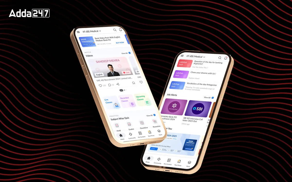
Unified Home Experience
Replaced the scattered Feed & Study Material dual-tab structure with a single, cohesive home screen organised around user intent: Watch, Practice, Read.
Improved Navigation
Reduced reliance on the hamburger menu by surfacing key sections directly in the bottom nav and home screen. Teacher-based navigation was elevated per user preference data.
Data-Driven Feature Placement
High-traffic content — Quizzes (1.47M clicks), Job Alerts, Study Materials, Current Affairs — was promoted to above-the-fold positions with visual hierarchy matching actual usage.
Engagement Boosters
Added daily streaks, badges, personalised educator recommendations, and community nudges to create sustainable return loops and build emotional connection with the platform.
Optimised Premium Visibility
Premium content and trial offers were repositioned with clear value framing — ensuring new users experienced product value before being redirected to purchase, reducing early drop-off.
Structured Onboarding Flow
New users now receive a guided, frictionless entry experience that showcases the app's core value proposition through self-trial flows before any premium upsell prompt.
Outcome
Impact of the redesign
The new design streamlined navigation, improved content discoverability, and prioritised high-engagement features — delivering a more intuitive, personalised learning journey.