
Client · Automotive
Tata Elxsi: an infotainment system and instrument cluster designed for the glance
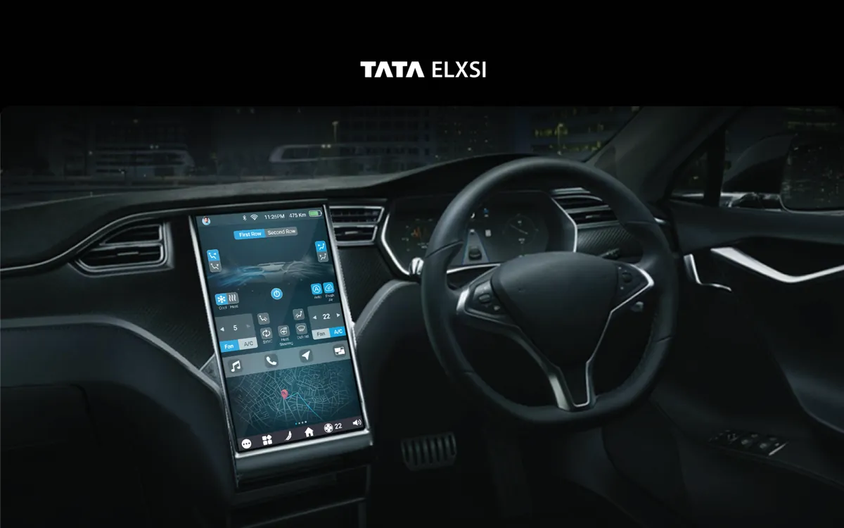
We designed two in-car HMI systems for Tata Elxsi, an infotainment interface and a digital instrument cluster for connected vehicles, working within a tier-one supplier's engineering constraints.
Executive summary
In a car, every glance at the screen is attention taken from the road. Designit designed two HMI systems for Tata Elxsi, an infotainment interface and a digital instrument cluster, around glance duration and context, keeping essential controls reachable and simplifying the interface as driving demands more attention.
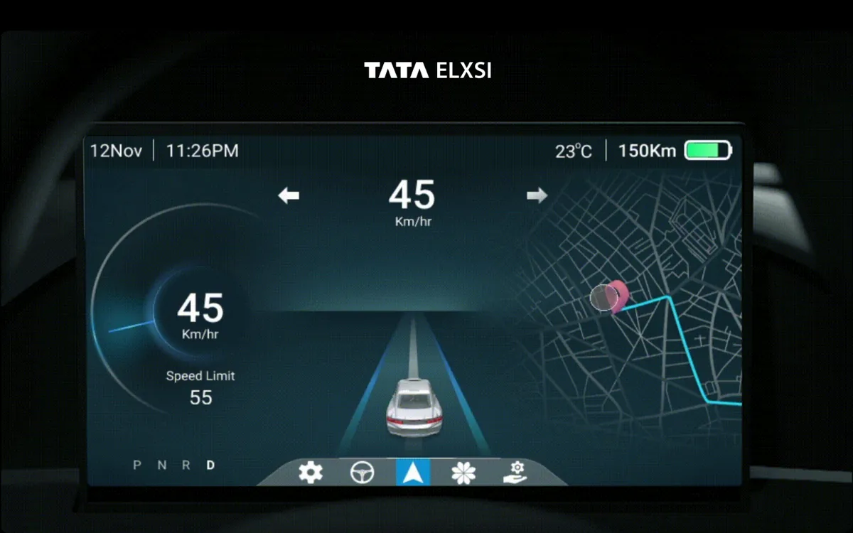
What changed is how the interface behaves: a layered interaction model instead of everything at once, an adaptive UI that simplifies at speed, a cluster that uses the digital medium for context rather than imitating analogue gauges, and interactions validated in driving-simulator conditions.
Project facts
- Industry
- Automotive HMI
- Product
- In-vehicle infotainment system and digital instrument cluster
- Users
- Drivers, from tech-savvy to those who only want music and navigation
- Our role
- Product and HMI design
- Scope
- Two HMI systems
- Validation
- Driving-simulator testing
Problem statement
How might we give drivers rich, modern in-car interfaces while every interaction stays within a safe glance?
Empathize
Who we designed for
Drivers whose real task is driving, and an OEM that needs interfaces meeting safety guidelines.
Drivers
Want navigation, media and vehicle information without taking their eyes off the road for long.
Passengers
Use the centre display for media and comfort while the car is moving.
The OEM
Needs glance-time limits, readability and a reusable design system.
Pain points
Interfaces were either too limited or too distracting.
Digital clusters imitated analog gauges.
Information needs change with speed and driving mode.
Readability had to hold in every light condition.
The business and driver problem
Existing infotainment systems were either too simple, missing features drivers expect from their phones, or too complex, creating dangerous distraction. Early digital clusters simply mimicked analogue gauges and wasted what a digital display can do. Both systems had to meet safety guidelines while serving very different drivers.
What we did
Safety standards and information needs
Guidelines on driver distraction and research into what drivers need to see in each context.
A layered interaction model
Essential controls always accessible; depth available without demanding attention.
Adaptive display modes
Information prioritised by driving context, with transitions that preserve focus.
Simulator testing
Interactions tested in driving-simulator conditions, because desk evaluation underestimates glance cost.
Automotive design system
Readability under all lighting conditions, with dark-mode-first design to reduce night glare.
Key lessons
- Layer the interface. Keep essentials one glance away; let depth wait.
- Simplify as speed rises. The interface should demand less when driving demands more.
- Use the digital medium. Context beats imitating analogue gauges.
- Design night mode first. Glare is a safety issue, not a theme.
Case studies
Every Tata Elxsi case study
Frequently asked questions
What did Designit design for Tata Elxsi?
Two in-car HMI systems: an infotainment interface and a digital instrument cluster for connected vehicles, designed within a tier-one supplier's engineering constraints. The work was also published on Behance.
How do infotainment and instrument cluster design differ?
The cluster is read, the infotainment is used. The cluster prioritises instant readability and adaptive information; the infotainment adds interaction, so it is governed by glance-time and interaction-depth limits.
How was the design validated?
Interactions were tested in driving-simulator conditions, because evaluating automotive interfaces at a desk underestimates how much attention they cost.
What is automotive HMI design?
Designing the human-machine interface in a vehicle: displays, controls and voice interactions. Safety is the core constraint, so every interaction has to work within a glance.
What are the glance-time guidelines for in-car screens?
NHTSA's visual-manual guidelines limit individual glances to about two seconds and total task time to twelve seconds. We used them as an interaction budget for every feature.
Why use driving simulators in HMI design?
Because what looks clear on a desk can be distracting at speed. Simulator sessions measure glance time, task time and lane deviation for each interaction.
How should a digital instrument cluster adapt to driving?
By prioritising different information in city, highway, sport and eco modes, with short, spatially consistent transitions so the driver stays oriented.
What contrast is needed for critical information on automotive displays?
Very high. The cluster system uses a minimum contrast of 7:1 for critical information, with type sizes calibrated for viewing distance and tested in bright and dark conditions.
Where can I see each Tata Elxsi system in detail?
The infotainment system and the digital instrument cluster each have their own case study, linked above.
Designing for the road?
Tell us about the hardware and the programme. We'll tell you how we'd model the glance budget.