
Tata Elxsi · Automotive HMI
Infotainment System
Next-gen in-vehicle infotainment balancing safety with intuitive controls.
Overview
Safety Meets Intuition
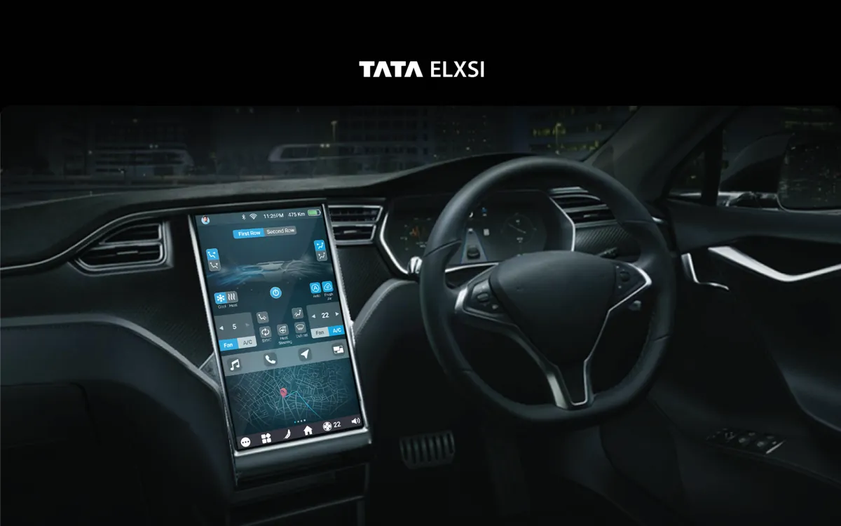
The infotainment system represents the primary touchpoint between driver and vehicle. We designed a next-generation interface that balances feature richness with safety-first principles. Navigation, media, climate control, phone integration, and vehicle settings are all accessible through a layered interaction model that ensures essential controls are always within one tap, while secondary features are neatly organized behind a single level of navigation. The dark-mode-first design reduces eye strain and glare during night driving.
- Tools
- Figma, After Effects, Driving Simulator
- Category
- Automotive HMI
- Services
- HMI Design, Interaction Design, Prototyping
Problem statement
How might we give drivers the features they expect from their phones while every interaction stays within a glance and a tap, safely?
Empathize
Who we designed for
In a car, the user's real task is driving. Every interaction with the screen competes with the road.
Tech-savvy drivers
Expect smartphone-level features and full control.
Everyday drivers
Want music, navigation and climate without complexity.
The OEM
Needs an interface that meets safety guidelines for glance time and interaction depth.
Pain points
Existing systems were either too limited or too complex and distracting.
Deep menus pulled drivers' eyes off the road for too long.
Small, icon-only targets caused mistouches.
The same interface was used on the highway and while parked.
Problem Statement
The Challenge
Automotive HMI design must work at a glance — drivers can't afford the cognitive load of complex interfaces. Existing systems were either too simple, missing features users expected from their smartphones, or too complex, creating dangerous distractions. The interface needed to serve both tech-savvy drivers who want full control and those who just want music and navigation without complexity. NHTSA guidelines mandate strict limits on glance time and interaction depth.
Design Process
How We Approached It
- Phase 01
Safety Standards Research
We studied automotive safety standards including NHTSA visual-manual guidelines, which specify maximum glance times of 2 seconds and total task times of 12 seconds.
We analyzed competitor infotainment systems from BMW iDrive, Tesla's touchscreen, and Mercedes MBUX to identify what works and what creates dangerous distractions. This research established our interaction budget for every feature in the system.
- Phase 02
Layered Interaction Model
We designed a layered interaction model where essential controls — volume, navigation, climate — are always visible on the home screen.
Secondary features are behind exactly one tap, never more. The layout uses large touch targets (minimum 44px) with generous spacing to prevent mistouch. Contextual controls appear based on driving state: media controls expand when audio is playing, navigation simplifies during active routing.
- Phase 03
Simulator Testing
We built prototypes and tested them in driving simulators, measuring glance time, task completion time, and lane deviation for every interaction.
The simulator sessions revealed that icon-only interfaces caused more cognitive load than icon+label combinations, and that bottom-of-screen placement reduced glance distance from the road. We iterated through 4 major design revisions based on simulator data.
- Phase 04
Adaptive UI System
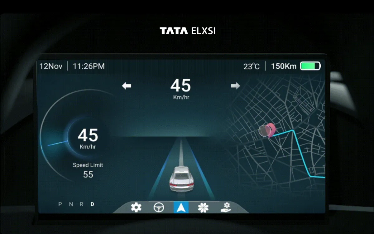
We created an adaptive UI that simplifies based on driving speed and conditions.
At highway speeds, the interface automatically reduces to essential controls with larger touch targets and higher contrast. In parking or stationary mode, the full feature set is available. This speed-responsive design ensures safety without permanently limiting the system's capabilities, giving drivers full access when it's safe to use.
Solution
What We Delivered
A production-ready infotainment interface that meets NHTSA safety guidelines while delivering a feature-rich experience. The layered interaction model keeps essential controls always accessible, the adaptive UI simplifies at speed, and the dark-mode-first design reduces nighttime glare. Every interaction was validated through driving simulator testing.
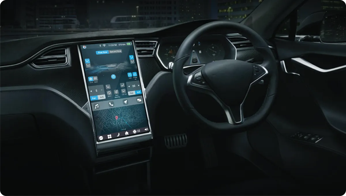
Glance-optimized UI
Large touch targets and high-contrast elements designed for 2-second glance times.
What Makes It Stand Out
Adaptive Complexity
Interface simplifies at highway speeds and expands features when stationary.
Voice Control Integration
Natural language voice commands for hands-free control of all major functions.
Navigation Integration
Seamless turn-by-turn navigation with predictive routing and live traffic overlay.
Media Controls
Contextual media interface supporting streaming, radio, and Bluetooth sources.
Vehicle Settings Hub
Centralized vehicle configuration for lighting, seats, mirrors, and driving modes.
Frequently asked questions
What is Infotainment System?
Next-gen in-vehicle infotainment balancing safety with intuitive controls.
What problem did Infotainment System solve?
Automotive HMI design must work at a glance — drivers can't afford the cognitive load of complex interfaces. Existing systems were either too simple, missing features users expected from their smartphones, or too complex, creating dangerous distractions. The interface needed to serve both tech-savvy drivers who want full control and those who just want music and navigation without complexity. NHTSA guidelines mandate strict limits on glance time and interaction depth. The question we set out to answer: How might we give drivers the features they expect from their phones while every interaction stays within a glance and a tap, safely?
How did Designit approach Infotainment System?
We worked in 4 phases: Safety Standards Research; layered interaction model; simulator testing; adaptive ui system. We studied automotive safety standards including NHTSA visual-manual guidelines, which specify maximum glance times of 2 seconds and total task times of 12 seconds.
What is automotive HMI design?
Designing the human-machine interface in a vehicle: the displays, controls and voice interactions drivers and passengers use. The core constraint is safety, so every interaction has to work within a glance.
What are the glance-time guidelines for in-car screens?
NHTSA's visual-manual guidelines limit individual glances to about two seconds and total task time to twelve seconds. We used them as an interaction budget for every feature.
How do you reduce driver distraction on a touchscreen?
Keep essential controls always visible, put secondary features no more than one tap away, use large targets with labels, and simplify the interface as speed increases. Simulator testing then measures glance time and lane deviation for each task.
Why test infotainment designs in a driving simulator?
Because what looks clear on a desk can be distracting at speed. Simulator sessions showed, for example, that icon-plus-label controls caused less load than icon-only ones.
How long does a Designit engagement take?
A Design Sprint is delivered in 5 business days. Full product design engagements run 4–12 weeks depending on scope. Monthly retainers are ongoing, with one active request at a time and a 24-hour response time.
Who actually works on the engagement?
Senior practitioners, from kickoff through to developer handoff. There are no account managers in the middle, no junior hand-offs once a contract is signed, and no offshore layer. Clients talk directly to the people producing the work, which is what keeps the feedback loop short enough to ship in days rather than weeks.
What tools does the studio work in?
Figma is the primary canvas, with prototyping in Figma or Protopie and engineering handoff through Figma Dev Mode. Research runs on Maze and Hotjar. Project tracking sits in Notion or Linear, and teams are welcome to work inside their own stack instead.
Have a similar problem?
Tell us what is not working. We'll tell you where we would start, and whether we're the right partner for it.