
EdTech design measured by completion, not by enrolment
Signing learners up is a marketing problem. Getting them to finish is a design problem, and it decides whether an education product actually works. We have designed modules across one of India's largest exam-preparation platforms.
What EdTech design has to solve
Motivation is the real constraint
Learners are blocked by effort, not the interface. Every unclear next step spends motivation they needed for the material.
High stakes, low tolerance
A timed test that mis-saves an answer can affect an exam outcome. Assessment needs failure handling closer to financial software.
Two users, one product
Learners want progress and clarity; parents or institutions want evidence and oversight.
The device is not a flagship phone
Much learning happens on mid-range Android devices on unreliable connections.
What we design
Onboarding and activation
Getting a new learner to a first genuine learning moment quickly.
Assessment and test-series engines
Reliable state handling, clear navigation, review flows and connection-loss recovery.
Live class interfaces
Video, materials and participation balanced without overwhelming a learner.
Performance dashboards
Progress shown to motivate rather than discourage.
Support-load reduction
Finding the interface ambiguities that generate repeat tickets and designing them out.
Low-bandwidth resilience
Mid-range hardware and intermittent connectivity as the default case.
How an EdTech engagement runs
Understand the learner
Research with real learners, including the ones who stopped.
Find the drop-off
Funnel and session analysis to locate where learners stall.
Design and test
Validated with learners on representative devices and connections.
Ship and measure
Handover, design QA and measurement against the completion metric agreed at the start.
What EdTech product leaders say
“The team at DesignIt brought a great balance of creative vision and thoughtful execution to the project. Their approach focused on building experiences that felt innovative while still remaining intuitive and user-friendly. The collaboration throughout the process was open, smooth, and highly productive.”
“Working with DesignIt was a highly collaborative experience. Their customer-first approach and strong understanding of UX helped us solve some of the trickiest product challenges. The UI refresh on one of Adda's highest-rated platforms received extremely positive feedback across the Ed-Tech space.”
“Working with DesignIt has been one of the most enriching experiences. Their approach consistently brought fresh perspectives and ideas that created real impact. The team showed a deep understanding of user behaviour and focused on building seamless experiences that could work well at scale.”
Public LinkedIn recommendations, reproduced verbatim.
Frequently asked questions
What actually improves course completion rates?
In our experience, reducing the effort required to resume. Most learners don't quit dramatically; they stop and find returning slightly too hard. Clear next steps, honest progress, resumable sessions and short first wins do more than gamification layers.
How do you design assessment interfaces that learners trust?
By treating state reliability as the primary requirement: answers visibly save, timers survive a refresh, connection loss is recoverable, and learners can see what they have answered without leaving the question.
Do you design for low-end devices and poor connectivity?
As the default case. That shapes image weight, offline behaviour, how much state lives on the device and whether an animation is worth its cost.
How do you balance learner and parent or institution needs?
Usually with separate views over shared data. Learners need encouragement and a next action; parents and institutions need evidence and comparison.
Can you work on live and synchronous learning?
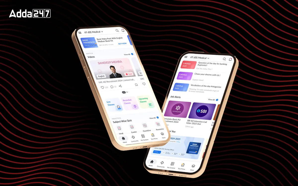
Yes. We designed the live class module for Adda247, where attention is already committed to the material and the interface has to support interaction without distraction.
Where do your learners stop?
Share your funnel from sign-up to first lesson. We'll tell you where we'd look first and what we'd test.