
Client · EdTech
Adda247: one coherent learning experience across a growing exam-prep platform
Adda247 helps millions of aspirants prepare for India's competitive government exams. We redesigned modules across the platform around how learners actually study, so it works as one product rather than a set of separate features.
Executive summary
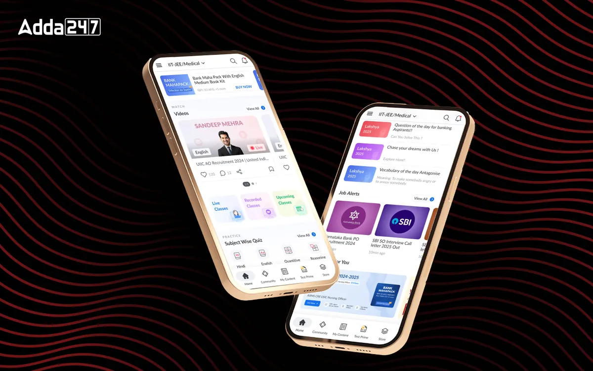
Adda247's platform had grown module by module, each solving its own problem in its own way. Designit redesigned modules across the platform, from the test-series engine and live classes to the performance dashboard, content library, community and native iOS and iPad apps, around learners' needs rather than the platform's internal structure.
What changed is how each part starts from the learner: purchased content organised by learning need instead of by product SKU, live classes brought in-house instead of on third-party streaming, performance data turned into next steps instead of raw tables, and a native experience for Apple users who previously relied on mobile web.
Project facts
- Industry
- EdTech, competitive-exam preparation
- Product
- Learning platform on web, Android, iOS and iPad
- Users
- Aspirants for SSC, banking, railways and other government exams; IIT/JEE aspirants; teachers
- Market
- India
- Our role
- UX research, product strategy, UI/UX design, design system, mobile app design
- Scope
- Multiple product modules, listed below
- Tools
- Figma, prototyping, user testing, analytics
Problem statement
How might we make a platform that grew module by module feel like one learning product, organised around how students actually prepare for exams?
Empathize
Who we designed for
Adda247 serves aspirants for SSC, banking, railway, defence and IIT-JEE exams, the teachers who teach them, and the teams who run the platform.
Aspirants
Practise mock tests, attend live classes and study from purchased content, often on a phone and a patchy connection.
Teachers
Teach live from studios and smart boards, and need tools that keep up with them.
Adda247 teams
Own different modules and needed them to feel like one product, with engagement that turns into paid plans.
Pain points
Each module solved its own problem in its own way.
Valuable features were buried behind navigation.
Purchased content was organised by product, not by learning need.
Performance data existed but was not turned into next steps.
The business problem
Valuable features existed but were not surfaced: the Sankalp Bharat app's home screen was a generic feed that students scrolled and closed. Live classes ran on third-party streaming that the platform could not control. Classroom smart boards were barely used beyond basic whiteboard functions, and Apple users had no native app.
Each issue lived in a different module, owned by a different team, which is how platforms end up feeling like several products.
The user problem
For learners, effort is the constraint. The test player created friction during high-stakes practice, with students losing track of time and navigation. Purchased content was organised by product package, so building a study plan was hard. Performance data was invisible or presented in tables that took effort to interpret.
What we did
Discovery with learners and teachers
Each module started with discovery and research into how its users study or teach, before any interface work.
Information architecture per module
Content reorganised around learning needs; the live class, test and dashboard flows restructured around the learner's task.
Wireframes and prototypes
Flows tested as prototypes before visual design, including state handling in timed tests.
Visual design and a shared system
High-fidelity design and handoff on shared foundations, so modules read as one platform across web, Android, iOS and iPad.
Key lessons
- Organise by need, not by SKU. What learners bought is not how they study.
- High-stakes tests need reliable state. Answers must visibly save and survive weak connections.
- Data helps only when it suggests a next step. Raw scores discourage; improvement paths motivate.
- Surface value where people already look. A home feed should lead with the platform's most useful features.
Case studies
Every Adda247 case study
Adda247
Homepage Revamp
A cluttered feed turned into a home organised around Watch, Practice and Read.
View case study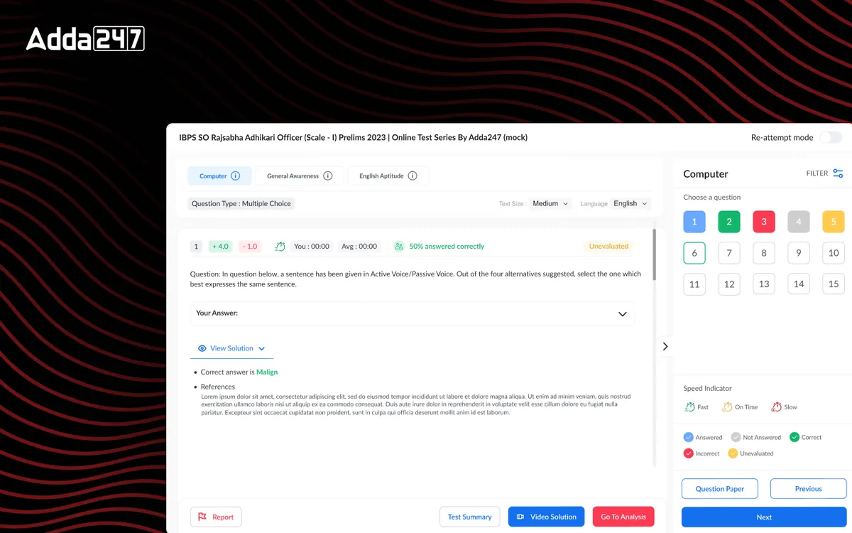
Adda247
Test Series
A calmer mock-test player and analytics that tell students what to practise next.
View case study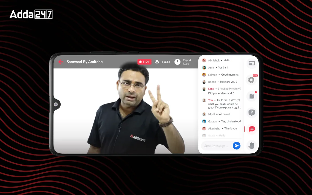
Adda247
Live Class Module
In-house live classes with chat, doubts, raise-hand and replay, replacing third-party streaming.
View case study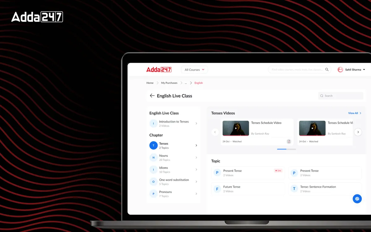
Adda247
My Content
Purchased courses reorganised by subject and topic, with progress learners can see.
View case study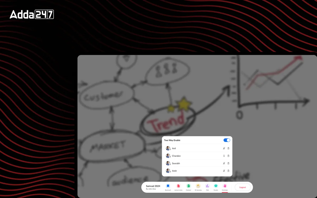
Adda247
Studio App for Smart Boards
A teaching tool for classroom smart boards: write, record, run polls and share in one place.
View case study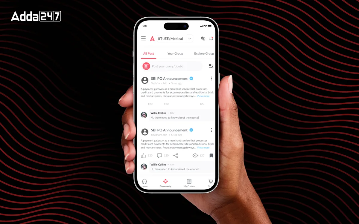
Adda247
Community Module
Peer learning inside the app: a discussion feed, study groups, profiles and recognition.
View case studyWhat the Adda247 team says
“The team at DesignIt brought a great balance of creative vision and thoughtful execution to the project. Their approach focused on building experiences that felt innovative while still remaining intuitive and user-friendly. The collaboration throughout the process was open, smooth, and highly productive.”
“Working with DesignIt was a highly collaborative experience. Their customer-first approach and strong understanding of UX helped us solve some of the trickiest product challenges. The UI refresh on one of Adda's highest-rated platforms received extremely positive feedback across the Ed-Tech space.”
Public LinkedIn recommendations, reproduced verbatim.
Frequently asked questions
Which Adda247 products did Designit design?
Designit designed nine modules across the platform. Six have a published case study: the homepage revamp, test series, live classes, My Content, the community module and the Studio app for smart boards.
How do you redesign a large EdTech platform without starting from scratch?
Module by module, around a shared set of principles and components. Each module started from its own users and problem, while a shared design language kept the platform coherent.
What makes UX design for competitive-exam apps different?
The stakes and the constraints: timed, high-pressure practice, very large audiences on mid-range phones and variable networks, and students who need to know exactly what to study next.
What did Designit design for Adda247?
Modules across Adda247's exam-preparation platform: the homepage, test series, live class module, performance dashboard, My Content, community, a studio app for classroom smart boards, the Sankalp Bharat app, and native iOS and iPad apps.
Which platforms did the work cover?
Web, Android, iOS and iPad, with platform-appropriate conventions on each.
Are outcome metrics published for this project?
Not on this page. Ask us on a call and we can talk through results we're able to share.
Did Designit design for web and mobile together?
Yes. The Adda247 work spans the web test player and content library, the Android apps, a native iOS and iPad app and a smart-board app for teachers, with shared principles so the experience stays consistent across them.
How do you design EdTech products for students on low-bandwidth connections?
Plan for poor networks from the start: lightweight screens, visible save states in timed tests, and graceful fallbacks such as audio-only live classes with slide sync and clear reconnection flows.
How should an EdTech company measure whether a redesign worked?
Agree the metric before designing: test completion, class attendance, content consumption, daily return or free-to-paid conversion, depending on the module. Then compare like for like after launch.
Where can I see each Adda247 module in detail?
Every module has its own case study, linked above, with the problem statement, who we designed for, the approach, the screens and a FAQ.
Have a learning product that needs this?
Tell us where your learners stall. We'll tell you where we'd start.