
Adda247 · EdTech
Test Series Enhancement
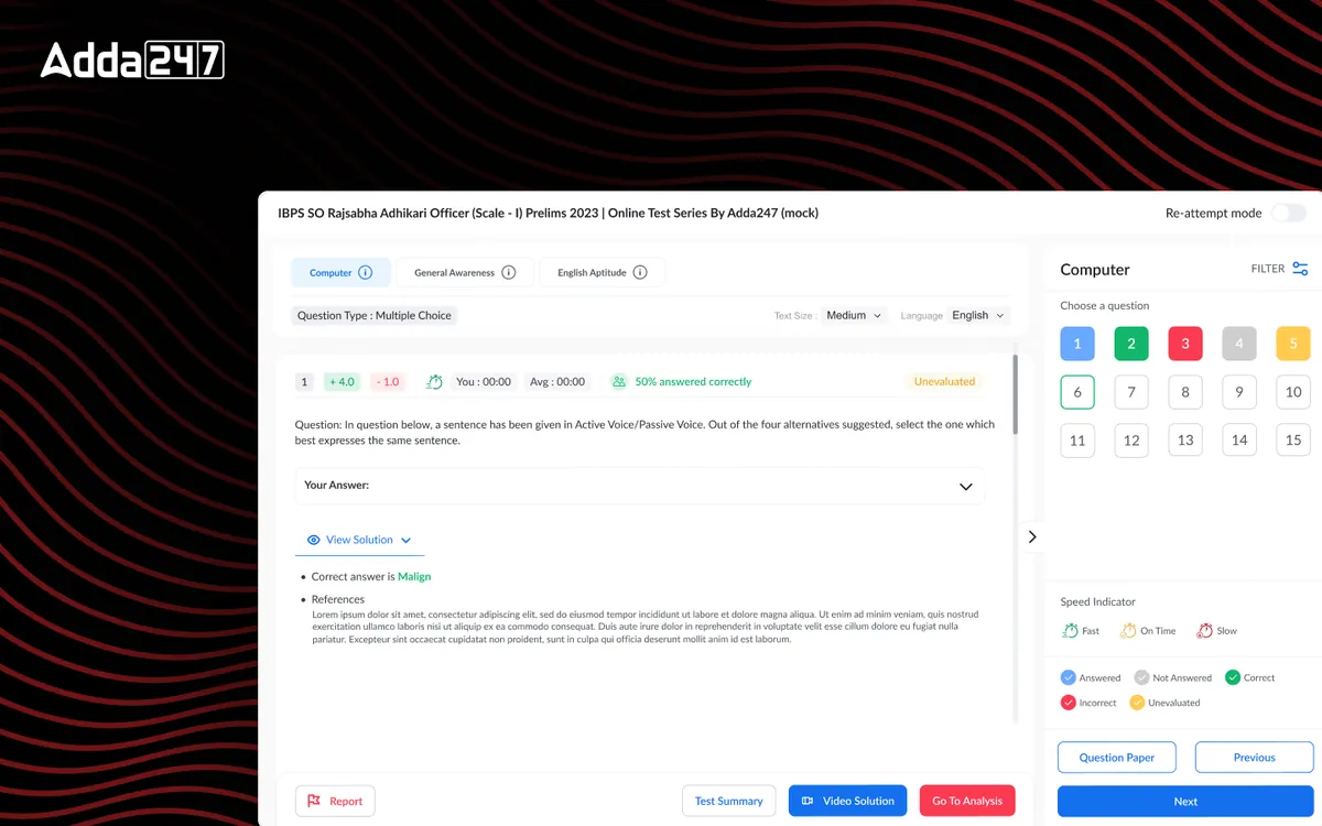
Comprehensive upgrade of the online test-taking experience for competitive exam students — from question navigation to performance analytics.
Overview
The Challenge & Opportunity
Adda 247's test series is the backbone of its competitive exam preparation platform, used by millions of students daily to practice mock tests for SSC, Banking, Railways, and other government exams. The existing test player was functional but dated — it created unnecessary friction during high-stakes practice sessions. Students struggled with navigation, lost track of time, and had limited insight into their performance after completing tests. We saw an opportunity to transform this core experience into something that genuinely helps students perform better under pressure while providing actionable post-test analytics.
- Tools
- Figma, Prototyping
- Category
- EdTech
- Services
- UI/UX Design, User Research, Data Visualization
Problem statement
How might we make timed mock tests feel like the real exam, without the confusion, and turn every finished test into a clear plan for what to practise next?
Empathize
Who we designed for
Aspirants for SSC, banking and railway exams take mock test after mock test. Under a timer, every extra click and every unclear status costs them marks.
Aspirants under time pressure
Practising full-length mocks against the clock. They need to move between questions and sections without thinking about the interface.
Repeat test-takers
Have taken dozens of tests and want to know which topics keep costing them, not just their latest rank.
Adda247's support team
Was answering a large share of tickets about question status and resuming interrupted tests.
Pain points
Moving between questions and sections took several clicks, so time was lost to navigation.
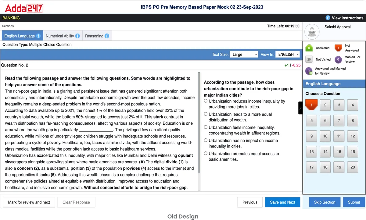
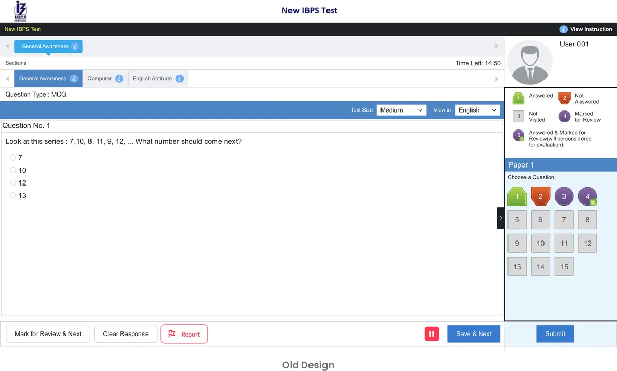
Status indicators for answered, skipped and flagged questions were unclear.
Interrupted tests were hard to resume.
After the test, students saw a score and little else: no weak areas, no time analysis, no trend.
The Problem
What Needed to Change
An interface that added anxiety
Students found the existing test interface confusing and anxiety-inducing. The UI did not simulate real exam conditions, which meant students were unprepared for the actual test environment when exam day arrived. Navigation between questions was clunky — requiring multiple clicks to move between sections — which caused unnecessary time loss during timed practice sessions.
Scores without a next step
Performance analytics were limited to basic score summaries. Students had no way to identify their weak areas, track improvement trends over time, or understand which question types consumed the most time. This meant study time was spent inefficiently, with students re-practicing topics they already knew well while neglecting areas that needed attention.
A support queue full of test questions
Support tickets related to the test series module accounted for nearly 40% of all customer queries — ranging from confusion about question status indicators to inability to resume interrupted tests. The business impact was clear: low test completion rates, poor retention after initial sign-up, and negative app store reviews citing the test experience specifically.
Design Process
How We Approached It
- Phase 01
Discovery & Research
We conducted in-depth interviews with 50+ students across different exam categories — SSC, Banking, and Railways aspirants — to understand their pain points during mock tests.
We analyzed completion rate data across 10,000+ test sessions to identify exact drop-off points. Competitive analysis of 8 rival platforms revealed industry best practices and gaps. We also shadowed 15 students during live test sessions, documenting every moment of confusion, hesitation, or frustration.
- Phase 02
Information Architecture
We mapped the complete test-taking journey from test selection through to performance review — a flow spanning 23 distinct screens.
Through this mapping, we identified 12 critical friction points in the existing journey, including redundant confirmation screens, unclear question status indicators, and a confusing section-switching mechanism. We redesigned the navigation hierarchy to prioritize the most common actions: answering, flagging, skipping, and reviewing questions.
- Phase 03
Wireframing & Prototyping
We created low-fidelity wireframes for the test player, question navigator, section timer, and results dashboard.
Three distinct layout approaches were explored — sidebar navigation, bottom-bar navigation, and an overlay panel approach. Each was prototyped as an interactive Figma prototype and tested with 20 students in moderated usability sessions. The sidebar approach won decisively, with 85% of testers finding it the most intuitive for tracking progress during tests.
- Phase 04
Visual Design & Handoff
The final visual design system introduced a calming color palette to reduce test anxiety, clear typographic hierarchy for readability under pressure, and prominent but non-distracting progress indicators.
We delivered pixel-perfect screens for all 23 flows, a comprehensive component library with 60+ reusable components, and detailed interaction specifications. Developer handoff included annotated Figma files, a behavior specification document, and weekly sync sessions during the 6-week build phase.
The Solution
What We Built
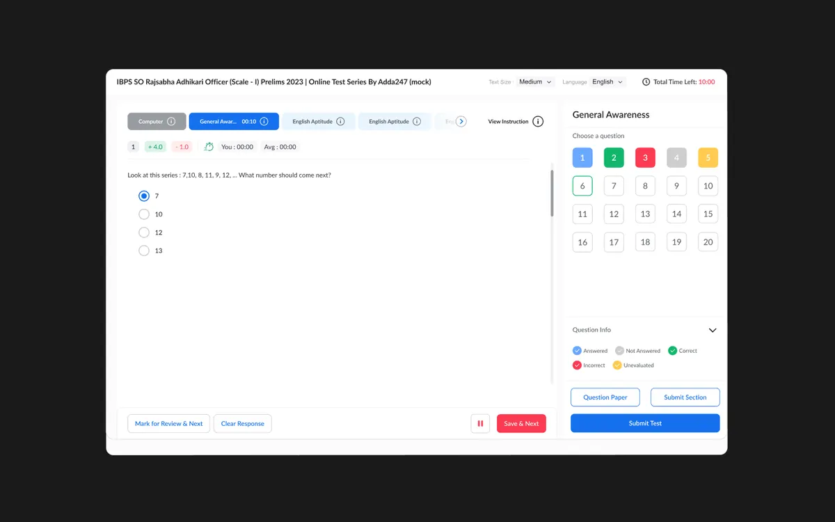
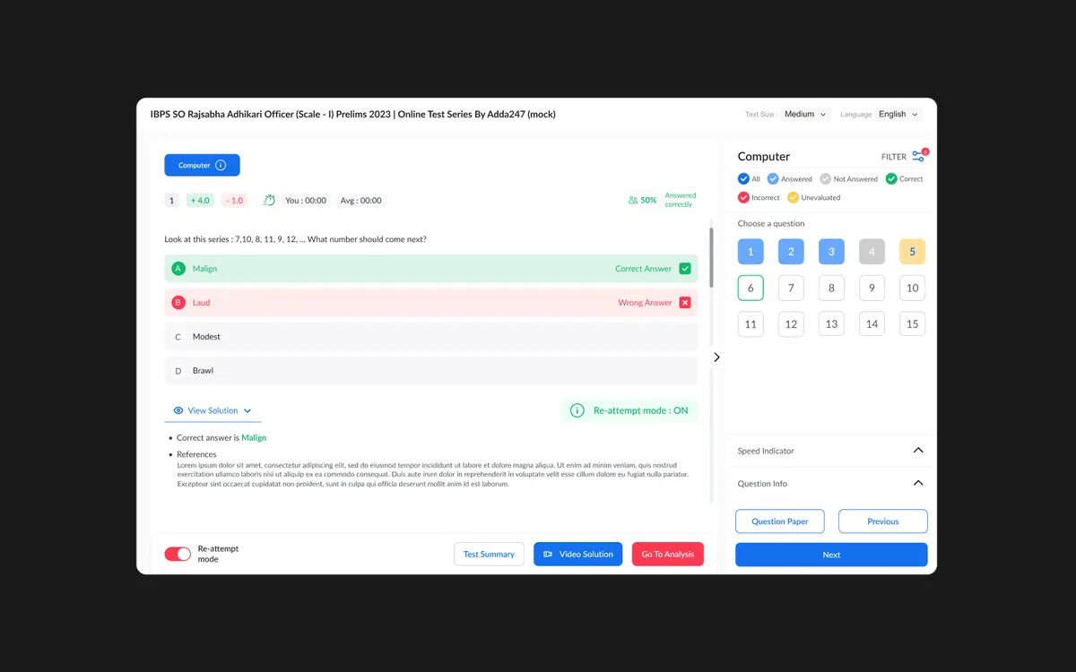
We reimagined the test player from the ground up with a focus on reducing cognitive load during high-pressure timed sessions. The new interface features a persistent sidebar with a visual question map showing answered, unanswered, flagged, and skipped questions at a glance. Section-wise timers help students allocate time strategically across different parts of the exam.
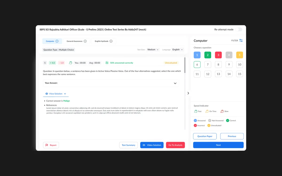
The post-test analytics dashboard was completely rebuilt to provide actionable insights — not just scores. Students can now drill down into time-per-question analysis, accuracy by topic, difficulty-level performance, and comparative rankings against peers. An intelligent recommendation engine suggests which topics to focus on based on historical performance patterns, turning raw data into a personalized study plan.
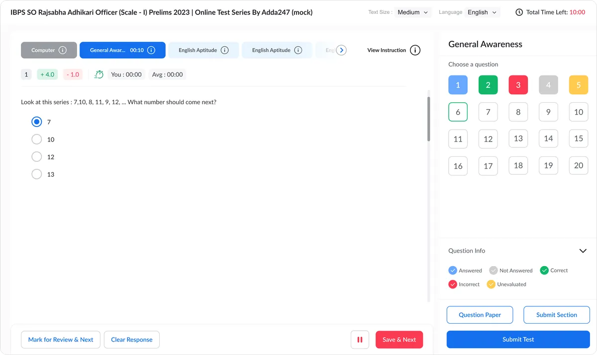
Smart Question Navigator
One-click navigation to any question with color-coded status indicators and keyboard shortcuts for power users.
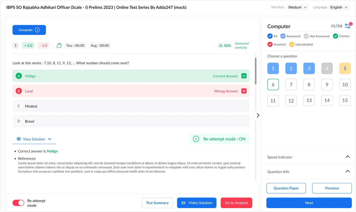
Review & Retry System
Comprehensive post-test review with detailed solutions, the ability to retry only incorrect questions, and spaced-repetition reminders for weak topics.
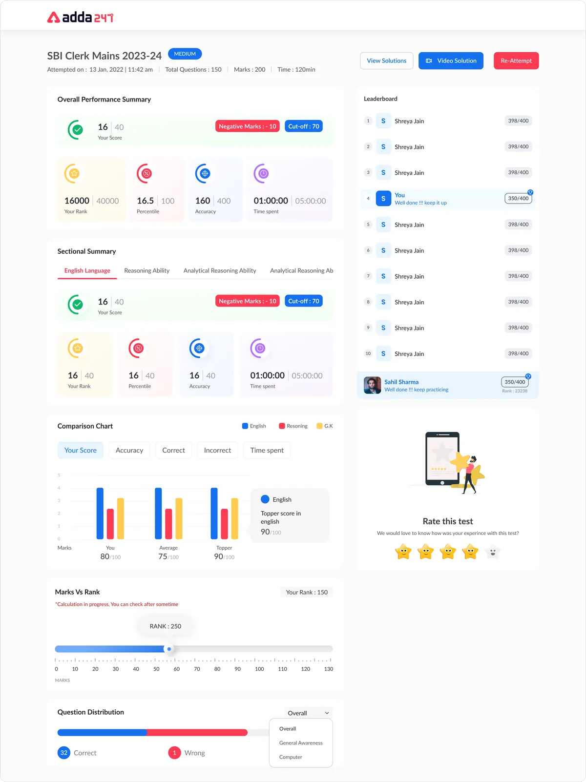
Detailed Performance Analytics
Post-test dashboard with time-per-question analysis, topic-wise accuracy, difficulty breakdown, and peer comparison — turning scores into study strategies.
Design Highlights
Real-time Progress Tracking
A persistent visual question map showing answered, unanswered, flagged, and skipped questions — providing instant awareness of test completion status without breaking focus.
Section-wise Timer
Individual countdown timers for each test section with visual warnings at threshold points, helping students allocate time strategically across the exam.
Exam Simulation Mode
Full-screen distraction-free mode that mirrors actual exam conditions including section locks, time limits, and negative marking — preparing students for reality.
Before and after
Where the test player started
The previous player, left, and the redesigned experience: the same exam content with clearer status, calmer colour and a persistent question map.
Frequently asked questions
What is Test Series Enhancement?
Comprehensive upgrade of the online test-taking experience for competitive exam students — from question navigation to performance analytics.
What problem did Test Series Enhancement solve?
Students found the existing test interface confusing and anxiety-inducing. The UI did not simulate real exam conditions, which meant students were unprepared for the actual test environment when exam day arrived. Navigation between questions was clunky — requiring multiple clicks to move between sections — which caused unnecessary time loss during timed practice sessions. The question we set out to answer: How might we make timed mock tests feel like the real exam, without the confusion, and turn every finished test into a clear plan for what to practise next?
How did Designit approach Test Series Enhancement?
We worked in 4 phases: Discovery & Research; information architecture; wireframing & prototyping; visual design & handoff. We conducted in-depth interviews with 50+ students across different exam categories — SSC, Banking, and Railways aspirants — to understand their pain points during mock tests.
What makes a good online mock test interface?
It should simulate the real exam and then get out of the way: a persistent question map, unmistakable status colours for answered, skipped and flagged questions, section-wise timers, and navigation that never takes more than one click. Everything else belongs after the test.
How should test results be presented to students?
As next steps, not just a score. The redesigned analysis breaks results down by topic, difficulty and time per question, compares them with peers, and points to the topics worth practising next.
How do you reduce test anxiety through design?
Remove surprises. A calmer palette, clear typographic hierarchy, visible progress and predictable navigation mean students spend their attention on questions rather than on the interface.
Why did the sidebar question navigator win?
In moderated testing it was the layout students found most intuitive for tracking progress while answering, compared with bottom-bar and overlay alternatives.
Should mock tests allow students to retry only the questions they got wrong?
Yes. Retrying incorrect questions, with explanations and spaced reminders for weak topics, turns a test from a verdict into practice.
How long does a Designit engagement take?
A Design Sprint is delivered in 5 business days. Full product design engagements run 4–12 weeks depending on scope. Monthly retainers are ongoing, with one active request at a time and a 24-hour response time.
More projects
Keep exploring
Adda247
Live Class Module
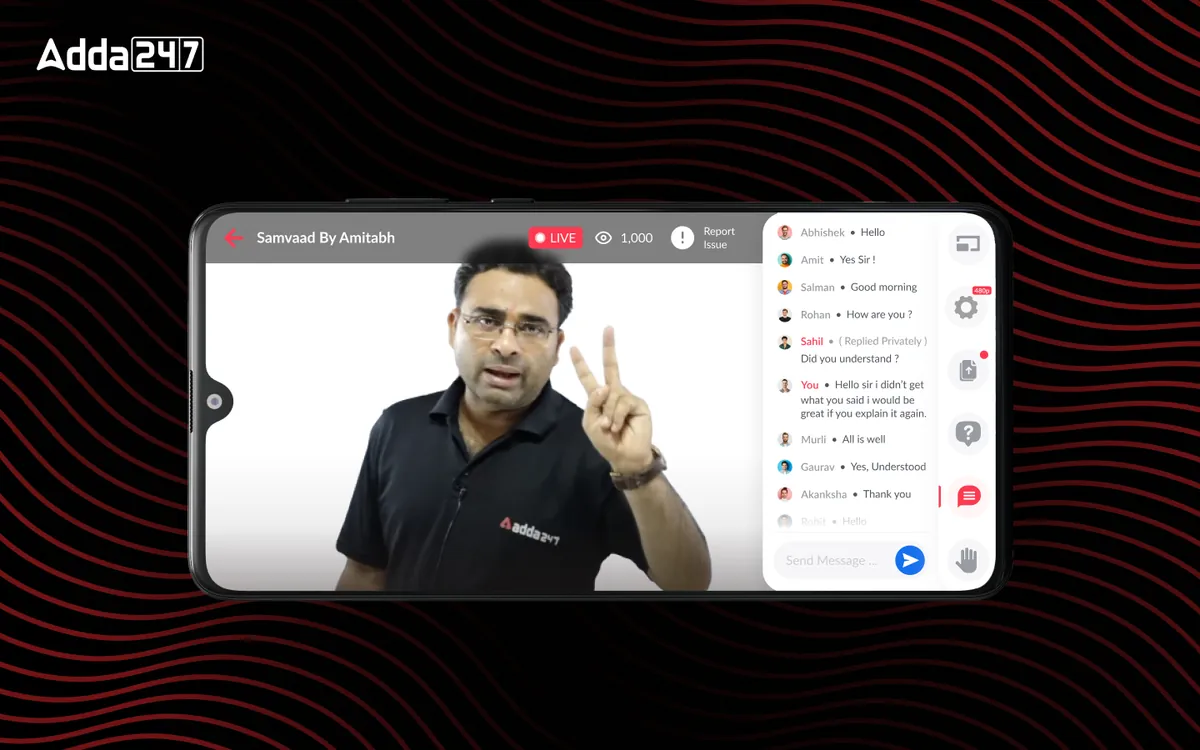
In-house live classes with chat, doubts, raise-hand and replay, replacing third-party streaming.
View case study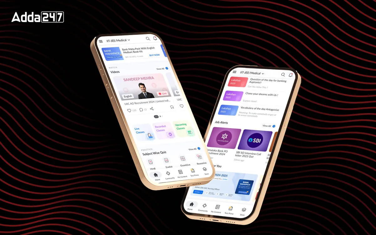
Adda247
Homepage Revamp
A cluttered feed turned into a home organised around Watch, Practice and Read.
View case study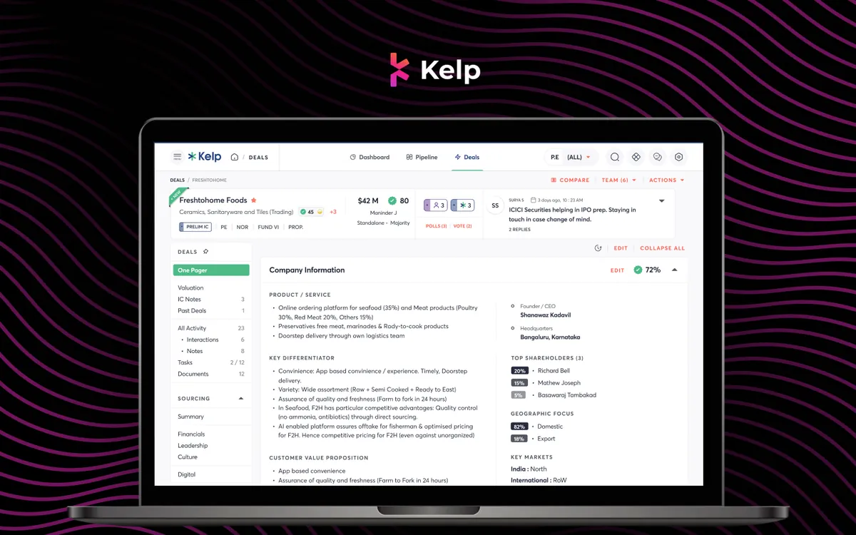
Kelp Global
Deals Module
Every deal's one-pager, IC notes, valuation and documents in one place, with companies compared side by side.
View case studyHave a similar problem?
Tell us what is not working. We'll tell you where we would start, and whether we're the right partner for it.