
Adda247 · EdTech
Keeping ADDA Home Simple & Approachable
Revamping the Adda247 home screen to enhance onboarding, boost engagement, and drive free-to-paid conversion for 3M+ competitive exam students.
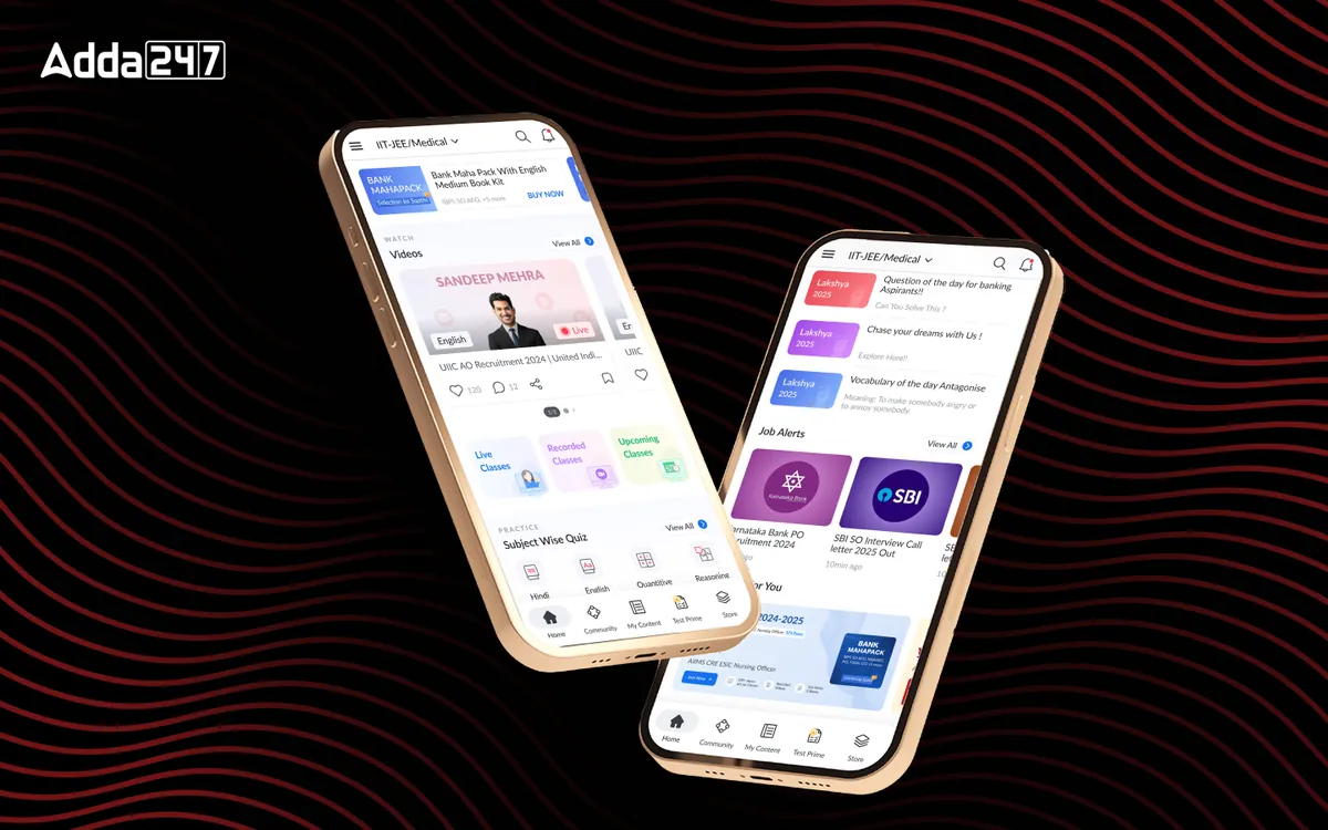
Project Overview
A smarter home for India's biggest EdTech
The Adda247 app serves millions of students preparing for competitive exams. However, its home screen felt outdated and failed to guide users effectively — leading to low retention and drop-off at a critical stage.
This project focused on revamping the home section to deliver a structured, frictionless onboarding flow for new users and a personalised, high-engagement experience for existing ones — while nudging free users toward paid conversion.
- Role
- Lead Product Designer
- Scope
- UX Research · Information Architecture · UI Design · Prototyping · Handoff
- Platform
- iOS & Android App
- Domain
- EdTech / Competitive Exams
Background
Setting up the context
The platform serves students and professionals who want quick access to study material, quizzes and career-related content. Navigation problems, cognitive overload and poor content prioritisation were getting in the way of all three.
Engagement potential was high, but the home screen was not keeping people. Fixing the experience could improve discoverability and retention, and lead to better learning outcomes: a home that feels more intuitive, more engaging and easier to come back to.
The brief was to revamp the home section so that new users get a structured, frictionless onboarding, existing users get a personalised and engaging experience, the interface builds trust with modern UI, and free users are nudged towards paid plans through self-trial.
Project goals
- Motivate users to explore and engage with the app.
- Enable self-trial for new and existing students, to drive product-led growth.
- Establish trust through a clean, modern interface.
- Nudge users towards paid plans, improving conversion.
Business Challenges
Four problems to solve
The platform had high engagement potential but was actively undermining its own retention and conversion goals.
Outdated UI
The home section lacked modern design aesthetics, making it less appealing and trustworthy — especially to first-time users evaluating whether to invest time in the platform.
High Drop-off Rates
Many new users abandoned the app immediately due to a poor onboarding experience. There were no guided entry points to communicate value before redirecting users to the store.
Lack of Product Discovery
Users struggled to navigate and understand the app's value proposition. High-click features like Quizzes and Job Alerts were buried — causing users to miss the most engaging content.
Retention Issues
Engaged users did not find enough reasons to return consistently. The home feed was cluttered with competing content types, banner ads, and cognitive overload that discouraged daily use.
Research & Insights
What the data revealed
Behavioural data from the app showed a clear gap between what students used most and what the home screen put first.
- 3.12M
clicks on study material, the most-used action, yet reaching it took extra navigation steps
- 1.47M
Daily Quiz clicks from 235K users, a top study tool that the home screen deprioritised
- 574K
Current Affairs clicks from 161K users, another high-intent feature that was hard to find
- 8.8%
of users interacted with video; students preferred text, and video discovery was weak
- 57.6%
of users (375K) opened the hamburger menu to reach study-material sections
- 3–5
scrolls was as far as most people went, despite a feed designed for infinite scroll
- 0.5%
of users shared content (6.5% commented, 2.2% liked posts): little reason to engage socially
- 110K+
unique users of premium content, which sat buried inside long lists
Problem areas
Where the old home screen got in the way
We audited the existing app screen by screen and grouped what we found into four problem areas.
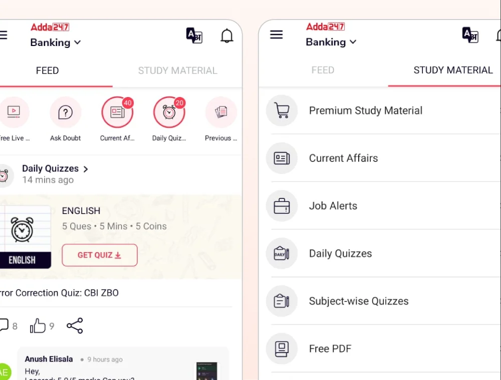
Navigation and discovery
- Dual-tab confusion
- Feed and Study Material as two tabs split attention and hid content.
- Ineffective navigation
- 375K users relied on the hamburger menu, a sign that key sections were hard to find.
- Teacher-based navigation
- Students prefer to reach material through specific teachers, but the app did not emphasise them.
Content accessibility and engagement
- Poor prioritisation
- High-click features (study material, quizzes, job alerts) were not visually prioritised; Daily Quiz was under-emphasised despite 1.47M clicks.
- Hidden premium content
- Premium content, used by 110K+ unique users, was buried in lists.
- Study material
- Long, unstructured lists made content hard to find, and similar icons made navigation unintuitive.
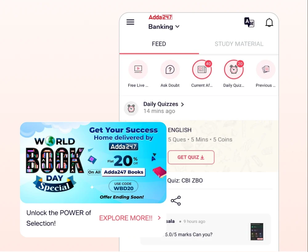
Cognitive overload
- Information overload
- A cluttered home and long articles raised cognitive strain; the feed was built for engagement but did not retain people.
- Feed issues
- Most users scrolled only 3–5 times, competing content types fought for attention, and banner ads broke the flow.
Barriers to learning
- Feature access
- Power Capsules (45K users) sat at the bottom of a list; videos had low engagement (57K users) yet appeared in several places; Current Affairs was placed twice.
- Buried material
- 60% of study materials lived in separate sections, which made them hard to reach.
- Onboarding
- New users were sent to the store too soon, before they had seen the product's value.
Problem statement
How might we create a seamless and engaging home experience that fosters trust, enhances product discovery, and motivates students to study — while reducing clutter, improving navigation, and leveraging top educators to drive retention and conversions?
Empathize
Who we designed for
Most people who open the Adda247 app are deciding, quickly, whether it is worth their limited study time. The home screen has a few seconds to answer that.
First-time free users
Often preparing for a government or defence exam, exploring before paying. They need to see value before they see a price.
Returning learners
Already studying, looking for today's quiz, current affairs or the class they bought. They need the next useful thing within reach.
The business
Needs engagement to turn into trust, and trust into paid plans, without banner ads crowding out the learning.
Pain points
The most-used content, study material, sat behind extra navigation steps.
Daily Quiz, a top feature, was visually deprioritised on the screen.
Video and community features were buried, so few people found them.
Heavy hamburger-menu use signalled that the home screen was not answering the question 'where do I go next?'.
Persona
Designing for Yash, a first-time free user
The persona that anchored every decision: a student exploring the app before paying, with limited money and a lot of choice.
First-time free user
Yash
Preparing for defence exams, Class 11
“I want to start my preparation early so that I can be fully prepared to crack the defence exam.”
- Age
- 17
- City
- Tier 2
What he wants
- High-quality learning material
- A free trial or an affordable plan, because he is careful about spending money
- Performance tracking and analysis
- Effective doubt resolution
- Motivational support
His pain points
- Feeling overwhelmed by the amount of study material online
- Struggling to find reliable sources and the courses best suited to him
- Struggling to convince his parents to buy the course he likes
Other apps he uses
- YouTube: free lessons from popular educators and motivational videos from student vloggers.
- Instagram and Snapchat: to connect and socialise with peers.
- WhatsApp: defence-aspirant groups for tips, free content and what to study (previous years' papers, mocks).
User journey
From searching to feeling prepared
We mapped Yash's journey across six stages to see where the app could help, and where it was losing him.
| Stage | Awareness | Consideration | Decision | Onboarding | Engagement | Completion |
|---|---|---|---|---|---|---|
| Goals | Find the best learning resources for the exam | Compare platforms and courses | Choose an affordable, effective course | Start using the platform effectively | Stay consistent with learning | Feel prepared and confident |
| Feeling | Curious, hopeful | Confused, cautious | Anxious, hesitant | Excited, slightly overwhelmed | Distracted, determined | Relieved, accomplished |
| Thinking | “Where can I find quality material?” | “Which platform suits me best?” | “Is this worth my money?” | “How do I make the most of this?” | “Am I learning effectively?” | “Did I learn enough?” |
| Doing | Browsing YouTube, social media and EdTech platforms | Checking free trials, reviews and recommendations | Evaluating pricing, free trials and content quality | Exploring the UI, setting up study plans | Watching videos, taking notes, joining discussions | Taking mock tests, reviewing content |
| Experience | Neutral | Anxious | Anxious | Neutral | Neutral to anxious | Relaxed |
| UX opportunities | Clear, engaging content that grabs attention early | Simpler course selection with guided recommendations and comparisons | Affordable plans, trial options and transparent pricing | Intuitive onboarding with tutorials | Gamification, reminders and peer interaction | Performance tracking, feedback and revision tools |
Emotional journey
Where the experience dipped
Each moment in the journey, and how it felt. The lows cluster around comparing options, prices and the first practice attempts, which is where the redesign focused.
Discovery
- Search for exam prepNeutral
- Compare different appsFrustrated
- Ask peers for recommendationsPositive
First interaction
- Download the appPositive
- Initial app explorationFrustrated
- Free content accessPositive
Evaluation
- Try free materialsNeutral
- Check course pricesFrustrated
- Compare with alternativesFrustrated
Decision making
- Course selectionFrustrated
- Payment considerationFrustrated
- Parental consultationNeutral
Early usage
- Content explorationPositive
- Schedule creationNeutral
- Practice attemptsFrustrated
Regular usage
- Daily study routinePositive
- Progress trackingPositive
- Doubt resolutionNeutral
Our Process
How we approached it
A structured four-phase design process grounded in user behaviour data and iterative validation.
- 01 — Discover
Research & Opportunity Areas
Behavioural analysis of 3M+ user interactions, heatmaps, session recordings, and stakeholder interviews to identify the biggest friction points and missed engagement opportunities.
- 02 — Define
What & How
Synthesised research into a clear problem statement, user persona (Yash — a first-time free user preparing for defence exams), and a structured information architecture for the new home experience.
- 03 — Ideate
Feedback, UX Patterns & Consistency
Explored multiple layout concepts around three content buckets — Watch, Practice, Read.
Validated patterns against competitive benchmarks and Adda247's own highest-performing content types.
- 04 — Design
Mockups, High-fidelity & Prototype Delivery
Iterated through multiple design rounds, built interactive prototypes for user validation, and delivered production-ready Figma files with full component documentation and developer handoff specs.
Information architecture
Mapping the app before redrawing it
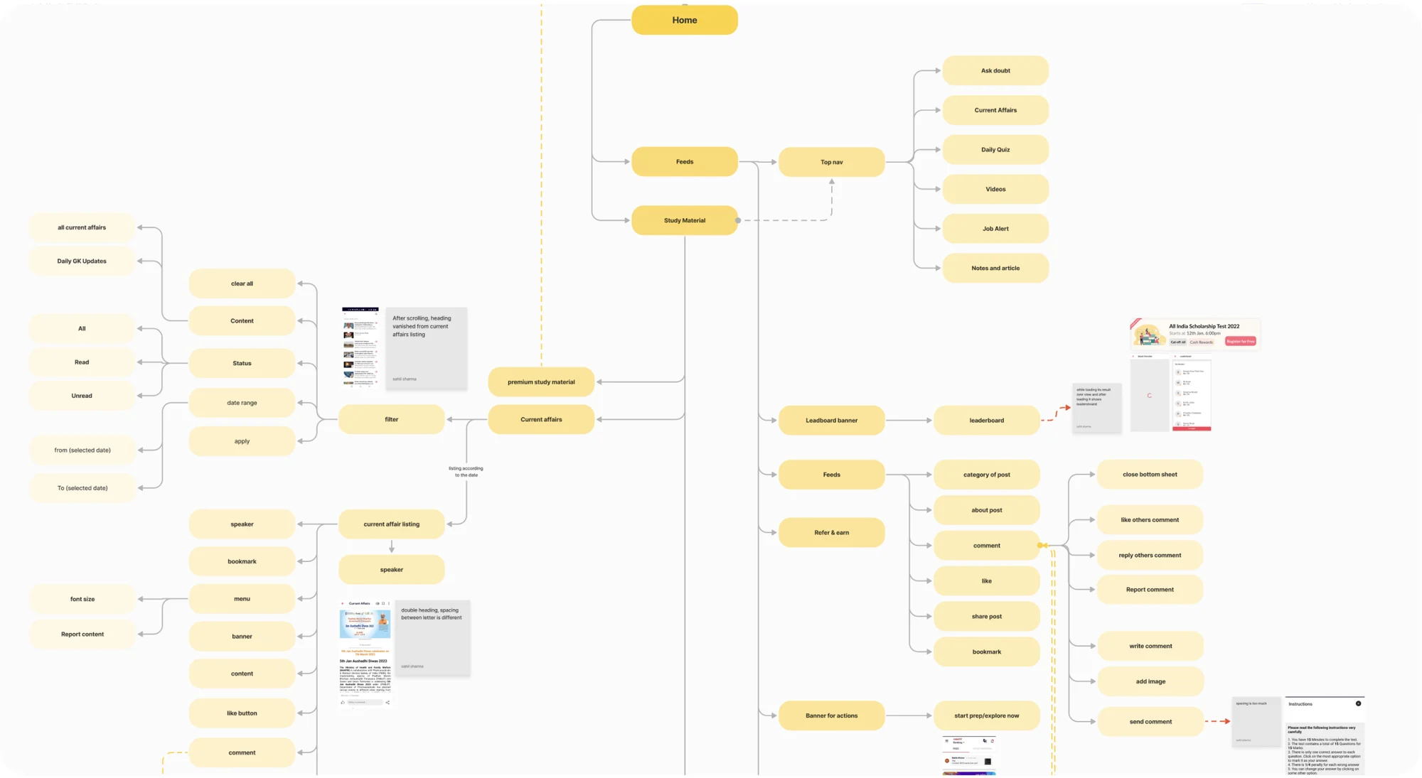
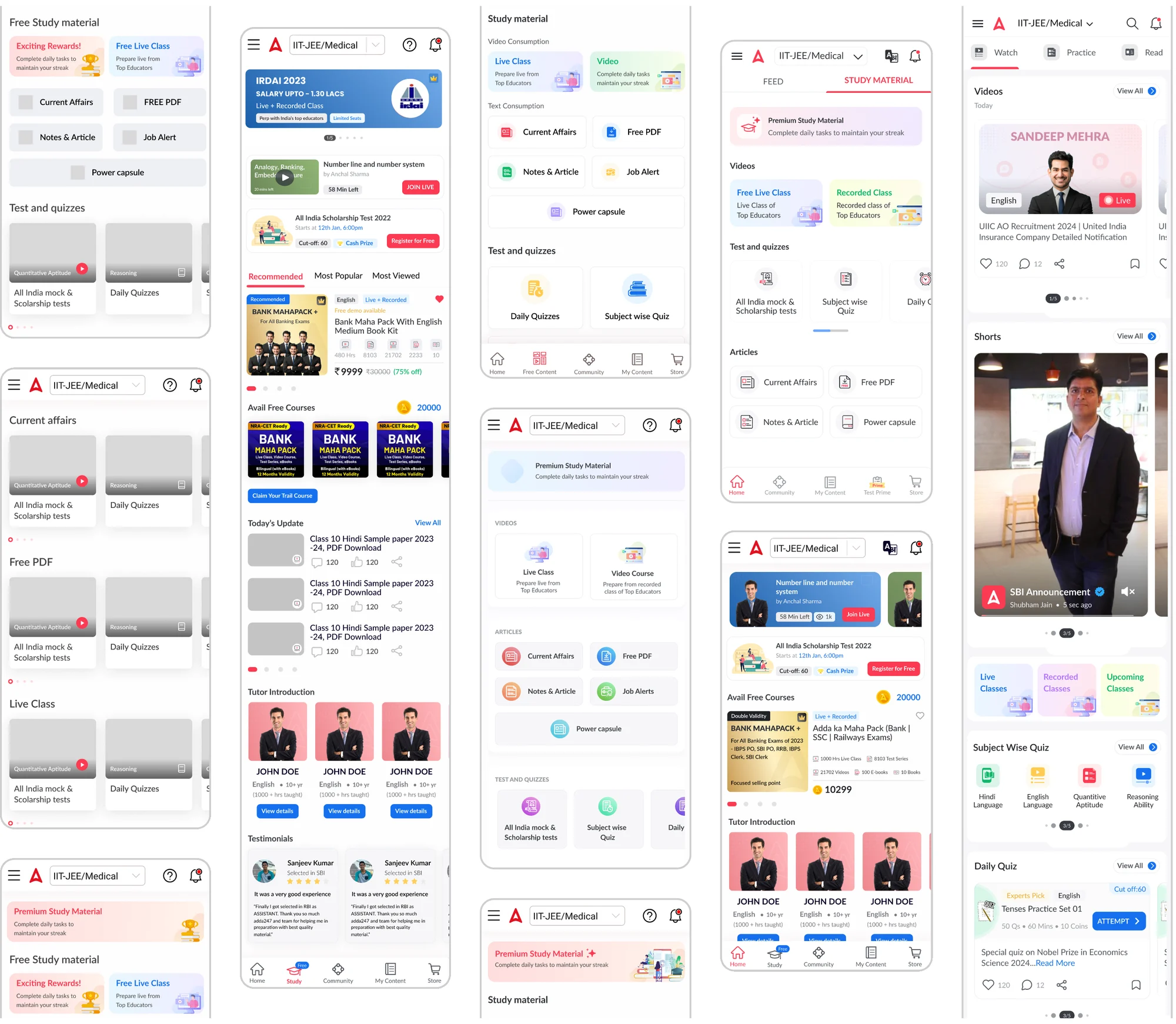
We mapped the existing structure, from the Feed and Study Material tabs down to filters, comments and banners, and annotated the problems on the screens themselves.
Iterations
Exploring the layout in rounds
Several directions for the home screen, from free-material grids to teacher-led layouts, converging on three clear sections: Watch, Practice and Read.
Visual development
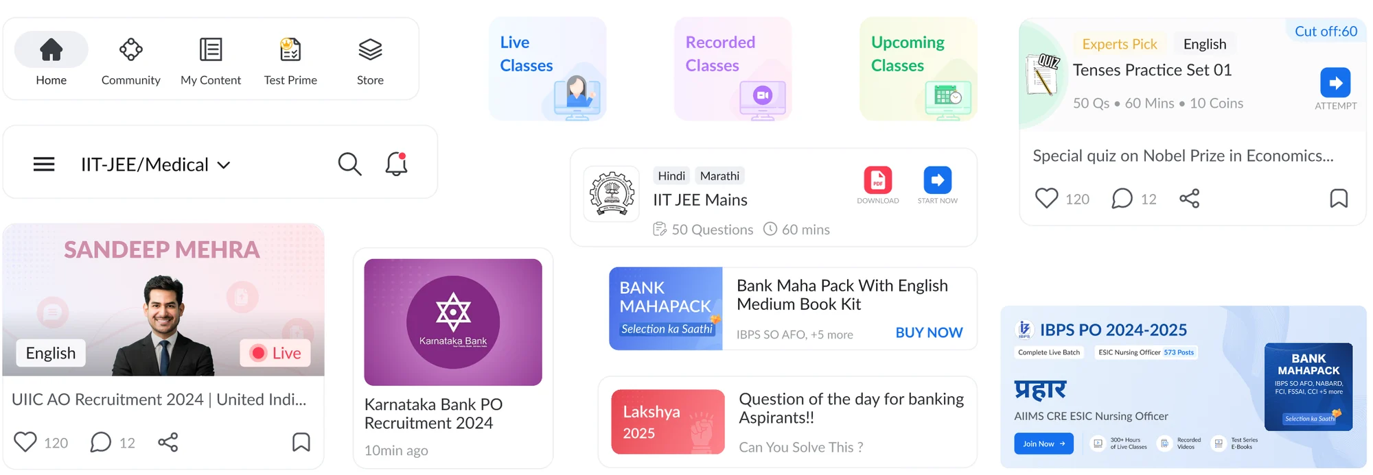
A component kit for the new home
Bottom navigation, the exam selector, educator video cards, class types, quiz cards, product and article cards, built as reusable components.
Refreshing the app
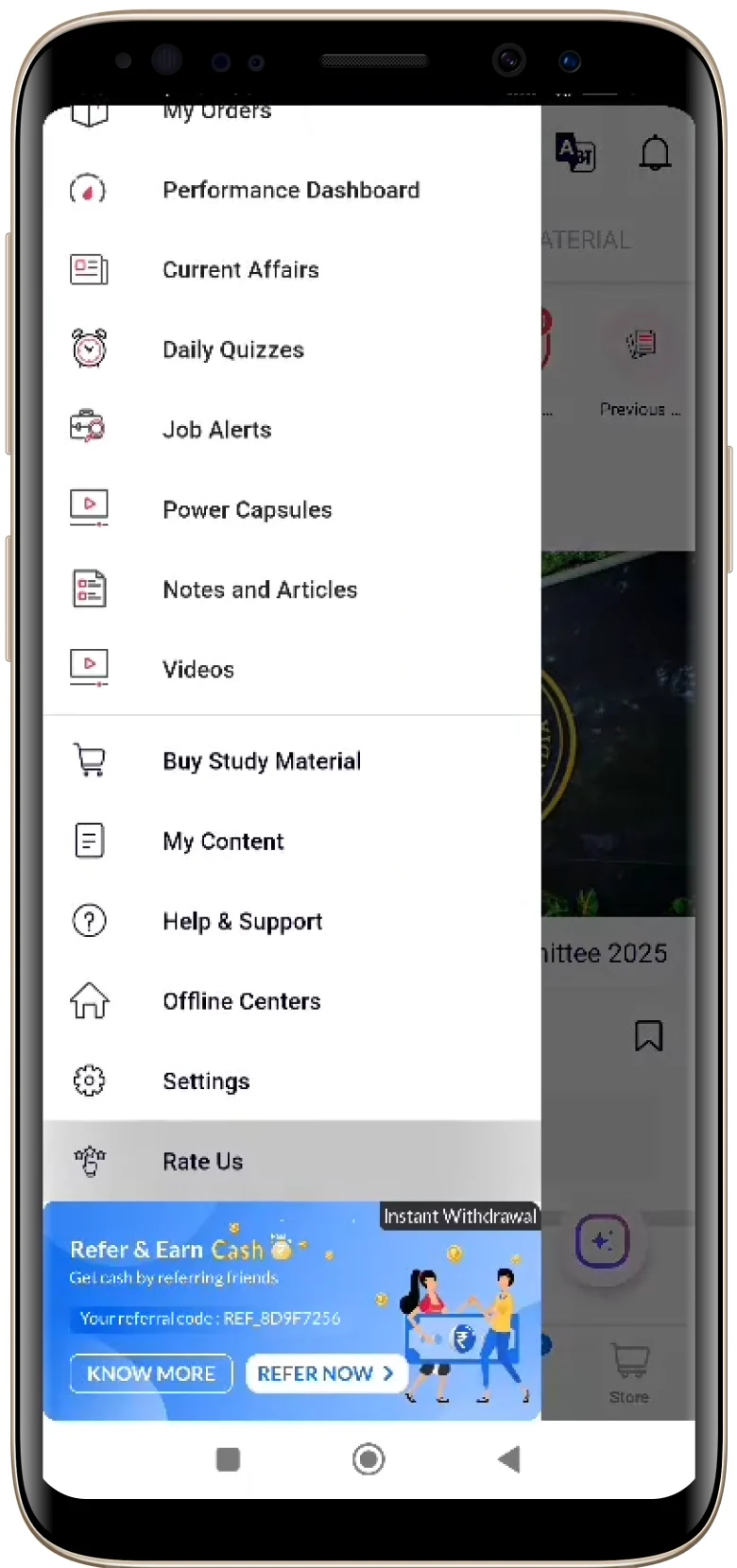
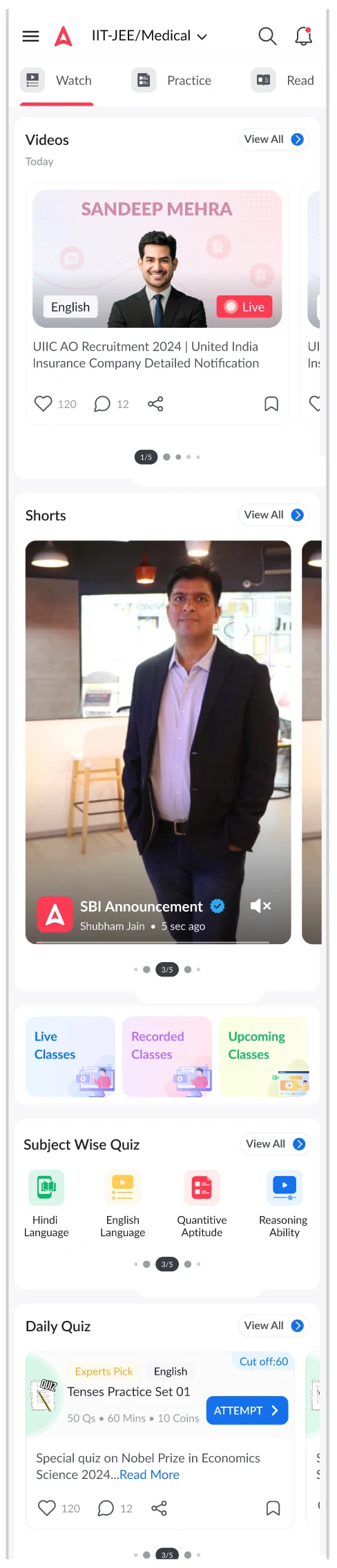
The home screen, before and after
From a menu-first app, where students opened the hamburger to find anything, to a home organised around what they came to do.
Design Decisions
What we redesigned
Five structural changes that transformed the home screen from a cluttered feed into a high-conversion learning hub.
Unified Home Experience
Replaced the scattered Feed & Study Material dual-tab structure with a single, cohesive home screen organised around user intent: Watch, Practice, Read.
Improved Navigation
Reduced reliance on the hamburger menu by surfacing key sections directly in the bottom nav and home screen. Teacher-based navigation was elevated per user preference data.
Data-Driven Feature Placement
High-traffic content — Quizzes (1.47M clicks), Job Alerts, Study Materials, Current Affairs — was promoted to above-the-fold positions with visual hierarchy matching actual usage.
Engagement Boosters
Added daily streaks, badges, personalised educator recommendations, and community nudges to create sustainable return loops and build emotional connection with the platform.
Optimised Premium Visibility
Premium content and trial offers were repositioned with clear value framing — ensuring new users experienced product value before being redirected to purchase, reducing early drop-off.
Structured Onboarding Flow
New users now receive a guided, frictionless entry experience that showcases the app's core value proposition through self-trial flows before any premium upsell prompt.
Conclusion
Impact of the redesign
The new design streamlined navigation, improved content discoverability, and prioritised high-engagement features — delivering a more intuitive, personalised learning journey.
- 3M+
Active users impacted by the redesigned home experience
- ↓ Clutter
Unified feed replaced dual-tab confusion and banner ad disruption
- ↑ Discovery
High-click features surfaced above the fold for immediate engagement
Frequently asked questions
What is Keeping ADDA Home Simple & Approachable?
Revamping the Adda247 home screen to enhance onboarding, boost engagement, and drive free-to-paid conversion for 3M+ competitive exam students.
What problem did Keeping ADDA Home Simple & Approachable solve?
The home section lacked modern design aesthetics, making it less appealing and trustworthy — especially to first-time users evaluating whether to invest time in the platform. The question we set out to answer: How might we create a seamless and engaging home experience that fosters trust, enhances product discovery, and motivates students to study — while reducing clutter, improving navigation, and leveraging top educators to drive retention and conversions?
How did Designit approach Keeping ADDA Home Simple & Approachable?
We worked in 4 phases: Research & Opportunity Areas; what & how; feedback, ux patterns & consistency; mockups, high-fidelity & prototype delivery. Behavioural analysis of 3M+ user interactions, heatmaps, session recordings, and stakeholder interviews to identify the biggest friction points and missed engagement opportunities..
What should an EdTech app's home screen show first?
What the learner came for, in the order they use it. For Adda247 that meant organising the home around three intents, Watch, Practice and Read, and promoting the most-used content (study material, Daily Quiz, Job Alerts, Current Affairs) above the fold, ahead of promotions.
How do you improve free-to-paid conversion without hurting engagement?
Let people experience value before the upsell. The redesigned home gives new users a guided self-trial of the core features and frames premium content by what it adds, instead of redirecting them to the store on first open.
Why does heavy hamburger-menu use matter?
It usually means the screen in front of people is not giving them a clear next step. On Adda247, menu taps were one of the signals that key sections needed to move into the bottom navigation and the home screen itself.
How do you decide what goes above the fold?
Usage data first, opinion second. We ranked features by how often learners actually used them and gave the visual hierarchy to match, so the most valuable actions are visible without scrolling.
What are engagement boosters in a learning app?
Small, honest reasons to come back: daily streaks, badges, educator recommendations and community nudges. They work when they reward real study, not just opening the app.
Who was the persona for the Adda247 home redesign?
Yash, a 17-year-old first-time free user from a tier 2 city preparing for defence exams. He wants quality material, a free trial or an affordable plan, progress tracking and doubt resolution, and he struggles with too much choice and with convincing his parents to pay for a course.
What did the Adda247 user journey map show?
The lowest moments came when students compared apps, checked prices, chose a course and made their first practice attempts. The redesign focused there: value before the store, clearer course information, and practice that is easy to start from the home screen.
How long does a Designit engagement take?
A Design Sprint is delivered in 5 business days. Full product design engagements run 4–12 weeks depending on scope. Monthly retainers are ongoing, with one active request at a time and a 24-hour response time.
Which regions does Designit work with?
Designit is based in Noida, India, and works with clients in India and the UAE; we also take on projects for teams in the United States and the United Kingdom. All communication is in English, and invoices are in the client's market currency: INR in India, USD in the US, GBP in the UK, and USD or AED in the UAE. Working hours overlap with EST and PST for US teams and with GMT for UK teams, so scheduled calls land inside a normal working day on both sides.
Who actually works on the engagement?
Senior practitioners, from kickoff through to developer handoff. There are no account managers in the middle, no junior hand-offs once a contract is signed, and no offshore layer. Clients talk directly to the people producing the work, which is what keeps the feedback loop short enough to ship in days rather than weeks.
What tools does the studio work in?
Figma is the primary canvas, with prototyping in Figma or Protopie and engineering handoff through Figma Dev Mode. Research runs on Maze and Hotjar. Project tracking sits in Notion or Linear, and teams are welcome to work inside their own stack instead.
More projects
Keep exploring
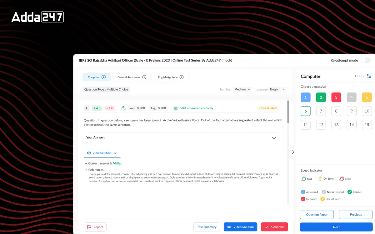
Adda247
Test Series
A calmer mock-test player and analytics that tell students what to practise next.
View case study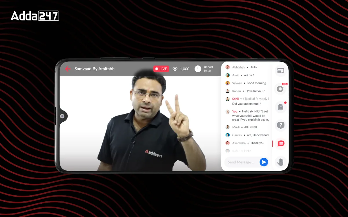
Adda247
Live Class Module
In-house live classes with chat, doubts, raise-hand and replay, replacing third-party streaming.
View case study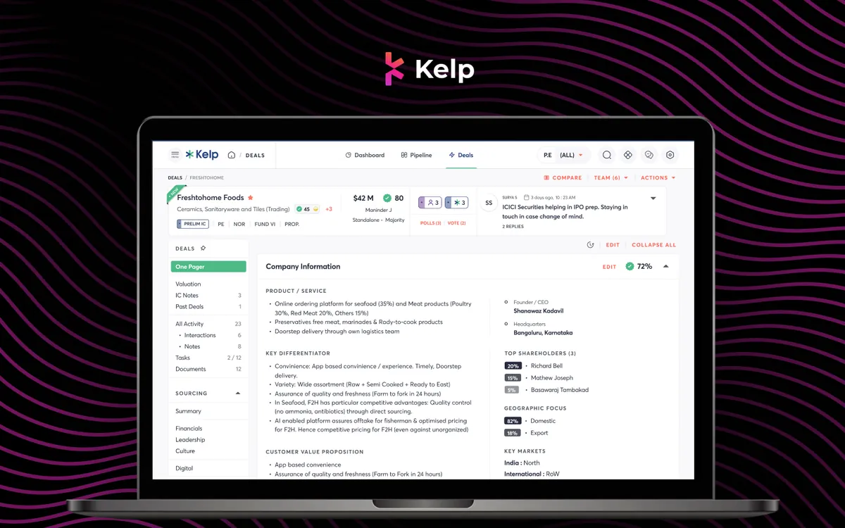
Kelp Global
Deals Module
Every deal's one-pager, IC notes, valuation and documents in one place, with companies compared side by side.
View case studyHave a similar problem?
Tell us what is not working. We'll tell you where we would start, and whether we're the right partner for it.