
Adda247 · EdTech
My Content
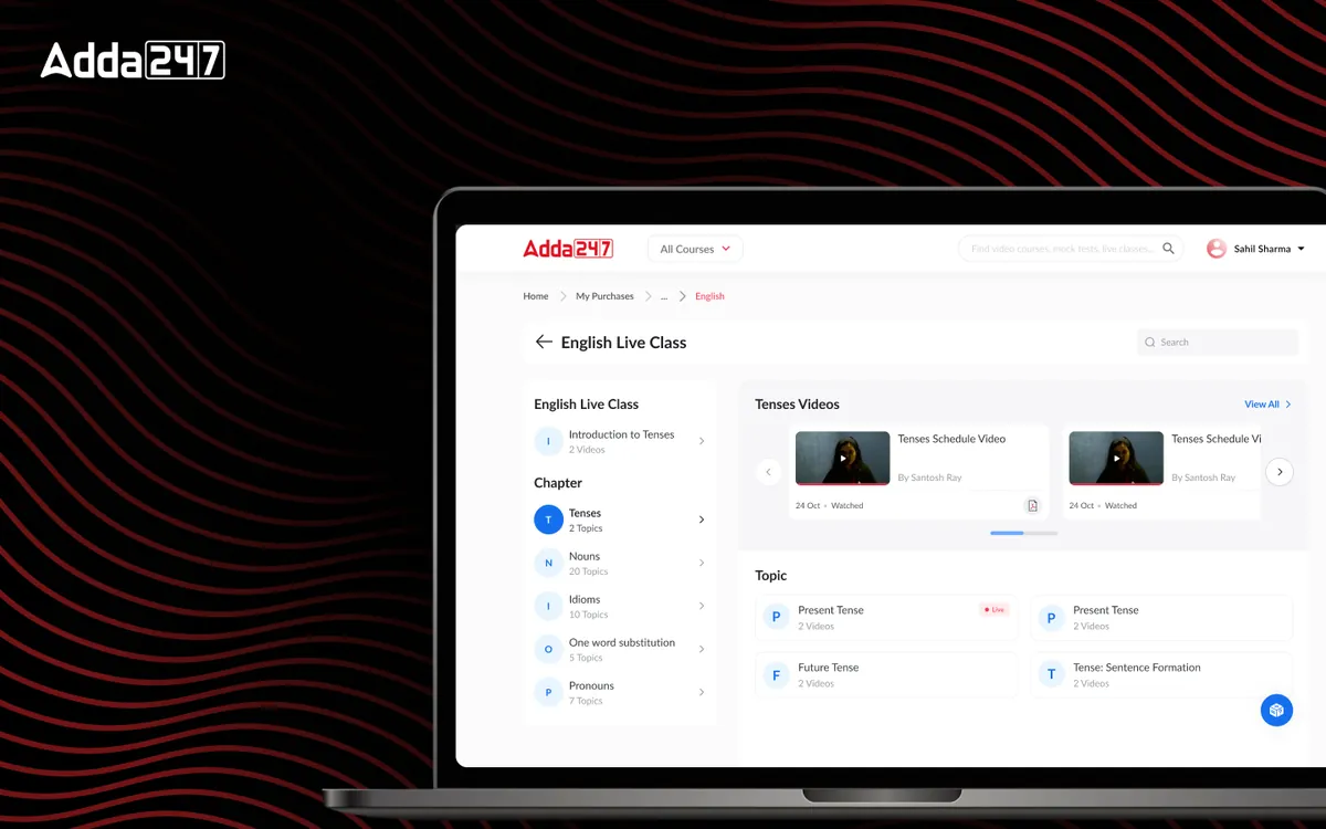
Redesigning the content consumption experience from package-centric to learner-centric — with clear progress tracking and intelligent recommendations.
Overview
The Challenge & Opportunity
Adda 247 offered hundreds of content packages — test series, video courses, e-books, and live class bundles. But once students purchased content, finding and consuming it was a frustrating experience. The "My Content" section was organized by product SKU rather than by learning need, making it nearly impossible for students to build a coherent study plan from their purchases. We redesigned the entire content consumption experience to put the learner at the center, organizing content by subject, topic, and learning stage rather than purchase history.
- Tools
- Figma, Prototyping
- Category
- EdTech
- Services
- UI/UX Design, Information Architecture, Content Strategy
Problem statement
How might we let students study from everything they have bought, organised the way they learn, by subject and topic, with progress they can see?
Empathize
Who we designed for
Students buy several packages for the same exam: a test series, a video course, an e-book. They think in subjects and topics, not in the names of what they bought.
Students with several purchases
Need one place to see everything for, say, Quantitative Aptitude, wherever it came from.
Students planning revision
Need to see which topics they have covered and where the gaps are, so they stop re-practising what they already know.
Adda247's content team
Produces excellent material that was getting buried under a structure built for selling, not studying.
Pain points
Many students could not locate content they had already paid for.
Content was listed by package name instead of by subject or topic.
There was no view of overall progress across purchases.
Students consumed only a fraction of what they bought, which hurt renewals.
The Problem
What Needed to Change
Organised by product, not by need
Students purchased content packages but couldn't easily find or track what they had bought. A survey of 500 users revealed that 65% couldn't locate specific purchased content within the app. Content was organized by product — "SSC CGL Tier-1 Test Series," "Banking Maha Pack," "Railway Group D Video Course" — rather than by what students actually needed: "Quantitative Aptitude practice" or "Reasoning video lessons." This product-centric model made perfect sense from a sales perspective but was completely wrong for the learning experience.
Invisible progress
Progress was completely invisible. Students had no way to see how much of their purchased content they had consumed, which subjects they had covered, or where gaps existed. Without this visibility, they couldn't make informed decisions about what to study next. They would repeatedly revisit topics they felt comfortable with while unconsciously avoiding areas where they were weak — the exact opposite of effective exam preparation strategy.
Value buried in the library
The lack of content discoverability also impacted business metrics. Students who couldn't find value in their purchases were less likely to renew subscriptions or buy additional packages. The content team was producing excellent material, but it was being buried under a poor organizational structure. Engagement data showed that students were consuming only 30% of their purchased content — a massive waste of both the student's investment and the company's content production effort.
Design Process
How We Approached It
- Phase 01
Discovery & Research
We surveyed 500 users about their content discovery frustrations, finding that 65% couldn't locate purchased content and 78% wished they could see their overall progress across all purchases.
We conducted card sorting exercises with 30 students to understand how they mentally organized study content — the universal model was subject > topic > content type (video/test/notes), not product package. We also analyzed content consumption data across 50,000 users to identify patterns: most students consumed content from multiple packages for the same subject, confirming that the package-based organization was fundamentally wrong.
- Phase 02
Information Architecture
We redesigned the content model around subjects, topics, and learning stages instead of products.
A student studying for SSC CGL would see their content organized as: Mathematics (with sub-topics like Algebra, Geometry, Number System), English (Reading Comprehension, Grammar, Vocabulary), Reasoning (Analogies, Series, Coding-Decoding), and General Knowledge. Within each topic, all relevant content — regardless of which package it came from — was unified. We also introduced three learning stages: Learn (videos, notes), Practice (topic-wise tests), and Test (full mock tests) — mapping to the natural study progression.
- Phase 03
Wireframing & Prototyping
We built and tested a personal dashboard prototype showing progress, bookmarks, and recommendations.
The dashboard featured a visual progress map — a grid showing subjects, topics, and completion percentage with color coding for strong, moderate, and weak areas. We tested three visualization approaches: percentage bars, heat maps, and radial charts. The heat map approach resonated most with students — they could instantly see their weak areas as "cold spots" that needed attention. We also prototyped the "resume where you left off" feature, which automatically surfaces the most relevant next piece of content.
- Phase 04
Visual Design & Handoff
We created a design system for content cards with clear status indicators and progress bars.
Each content card showed: type (video/test/notes), completion status, time estimate, and difficulty level. The color system used green for completed, blue for in-progress, and gray for not-started — providing instant visual scanning of progress. The strength/weakness map used warm-to-cool gradients for intuitive understanding. We delivered 35 screens covering all content states, empty states, filter combinations, and recommendation logic, along with a content card component library that the development team could use across the entire platform.
The Solution
What We Built
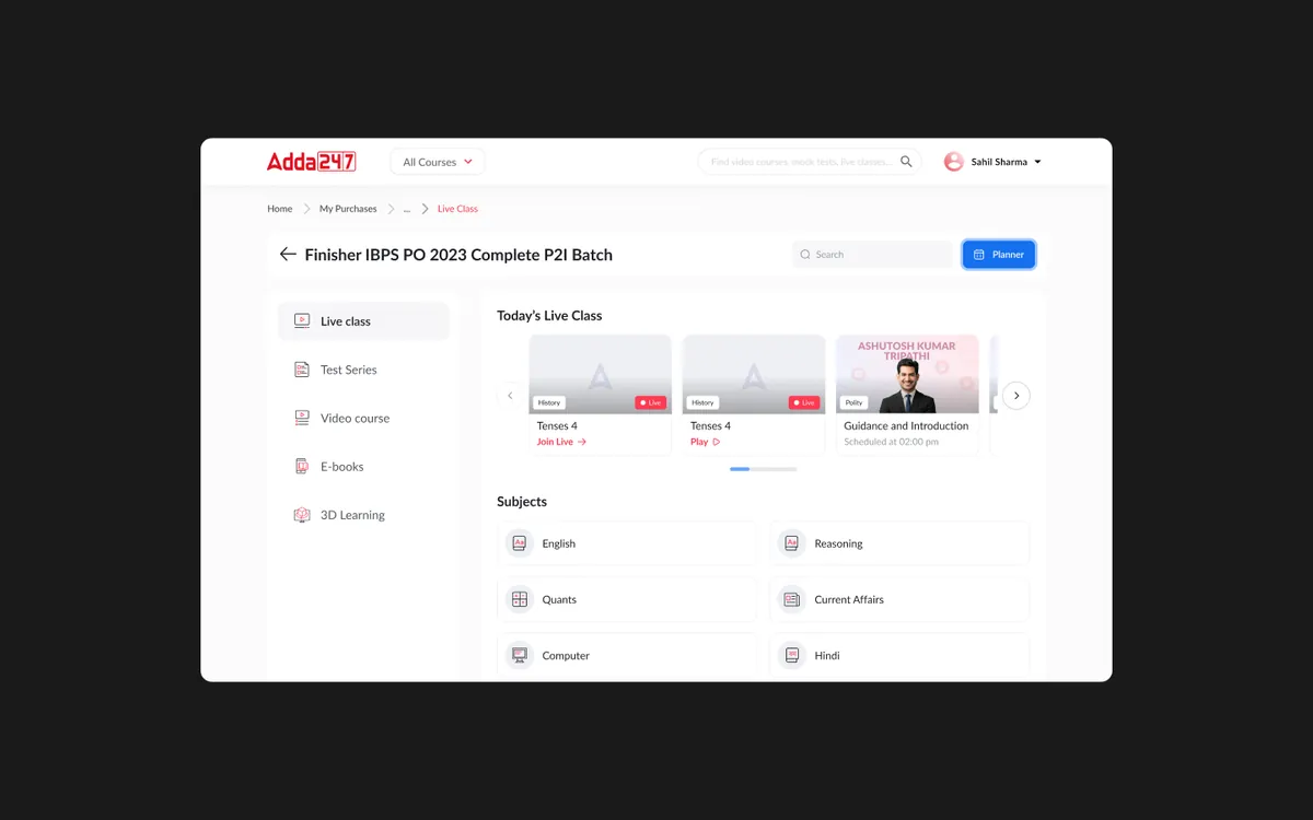
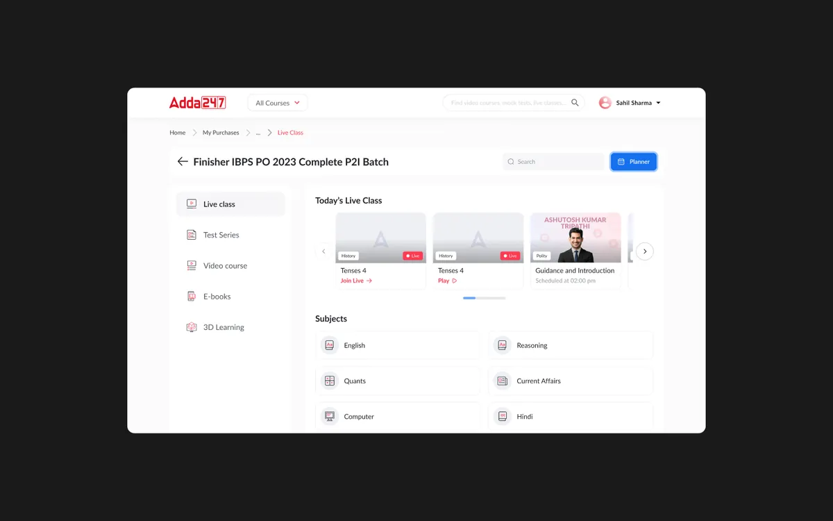
A learner-centric content hub that replaces the product-based content list with a unified, subject-organized learning dashboard. The "My Content" section now opens to a progress overview showing subjects, completion rates, and a personalized "What to study next" recommendation. Students can drill into any subject to see all available content — videos, tests, and notes — organized by topic with clear progress indicators at every level.
The strength/weakness map is the centerpiece of the experience — a visual heat map showing topic-level performance based on test scores, content consumption, and practice data. Red zones highlight areas needing immediate attention, while green zones confirm strengths. Smart recommendations use this data to suggest the most impactful next study action. A study streak tracker and daily goals system maintain motivation and build consistent study habits. Bookmark and resume features ensure students never lose their place across devices.
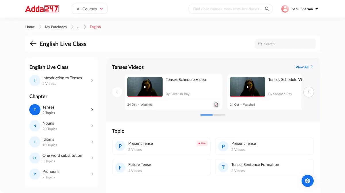
Subject-wise Organization
Content from multiple purchased packages unified under subjects and topics — eliminating the confusion of navigating by product SKU.
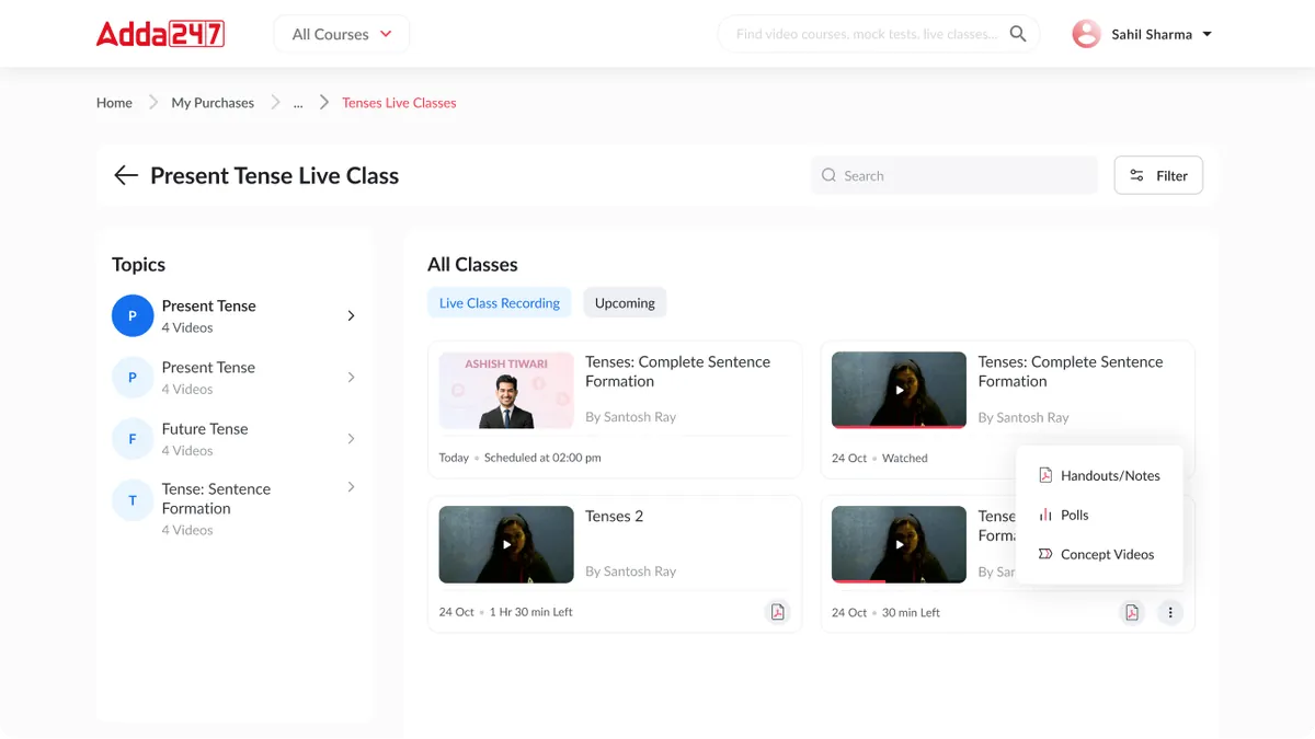
Every class carries its material
Each topic gathers its live-class recordings and upcoming sessions, and every class opens to its handwritten notes, polls and concept videos. Students stop hunting across packages for the material that goes with a lesson.
Design Highlights
Progress Tracking
Multi-level progress visualization from overall completion down to individual topic mastery — giving students a clear picture of their preparation status at every level.
Strength/Weakness Map
Visual heat map showing topic-level performance, making weak areas immediately visible and actionable. Color-coded from red (needs work) to green (strong).
Smart Recommendations
AI-powered suggestions for what to study next based on weak areas, exam proximity, and learning pace — turning data into a personalized study strategy.
Bookmark & Resume
Bookmark any content for later and seamlessly resume where you left off across devices. The app remembers your position in videos, tests, and reading materials.
Study Streak Tracker
Daily study streak with customizable goals, milestone celebrations, and gentle reminders — building the consistent study habits that drive exam success.
Gallery
Screens from My Content
Frequently asked questions
What is My Content?
Redesigning the content consumption experience from package-centric to learner-centric — with clear progress tracking and intelligent recommendations.
What problem did My Content solve?
Students purchased content packages but couldn't easily find or track what they had bought. A survey of 500 users revealed that 65% couldn't locate specific purchased content within the app. Content was organized by product — "SSC CGL Tier-1 Test Series," "Banking Maha Pack," "Railway Group D Video Course" — rather than by what students actually needed: "Quantitative Aptitude practice" or "Reasoning video lessons." This product-centric model made perfect sense from a sales perspective but was completely wrong for the learning experience. The question we set out to answer: How might we let students study from everything they have bought, organised the way they learn, by subject and topic, with progress they can see?
How did Designit approach My Content?
We worked in 4 phases: Discovery & Research; information architecture; wireframing & prototyping; visual design & handoff. We surveyed 500 users about their content discovery frustrations, finding that 65% couldn't locate purchased content and 78% wished they could see their overall progress across all purchases.
How should an online course library be organised?
By how people learn, not by what they bought. We moved Adda247's library from product packages to subject, topic and learning stage (learn, practise, test), and unified content from every purchased package under each topic.
How do you show learning progress across many courses?
Show it at every level: overall, by subject and by topic. The redesign pairs progress indicators on content cards with a strength-and-weakness view so students can see gaps at a glance.
What is card sorting and why did it matter here?
Card sorting asks people to group content the way they think about it. Students consistently grouped by subject, then topic, then content type, which confirmed that a package-based library was the wrong model.
How do you help students decide what to study next?
Use what you already know about them: weak topics, exam proximity and pace. The new My Content opens with a progress overview and a 'what to study next' recommendation, plus resume-where-you-left-off across devices.
How long does a Designit engagement take?
A Design Sprint is delivered in 5 business days. Full product design engagements run 4–12 weeks depending on scope. Monthly retainers are ongoing, with one active request at a time and a 24-hour response time.
More projects
Keep exploring
Adda247
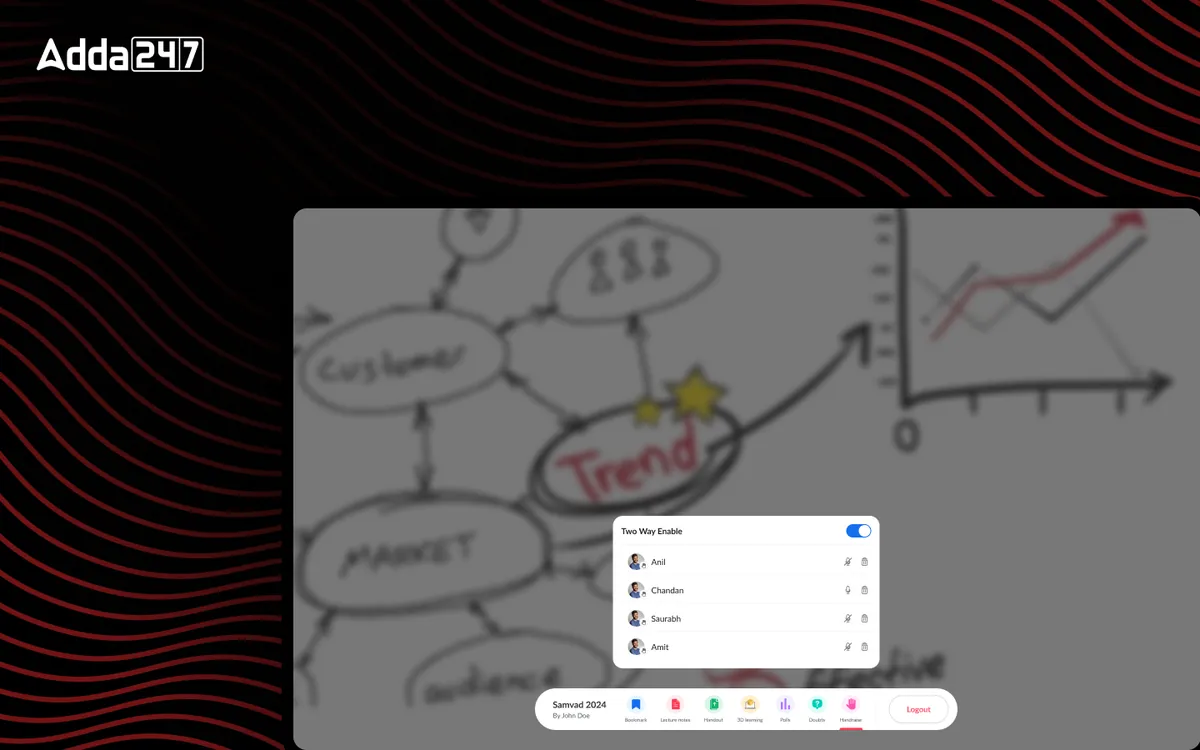
Studio App for Smart Boards
A teaching tool for classroom smart boards: write, record, run polls and share in one place.
View case study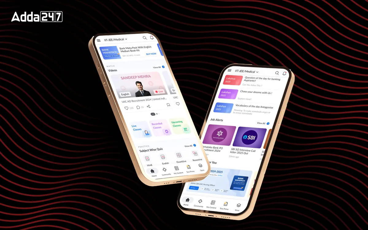
Adda247
Homepage Revamp
A cluttered feed turned into a home organised around Watch, Practice and Read.
View case study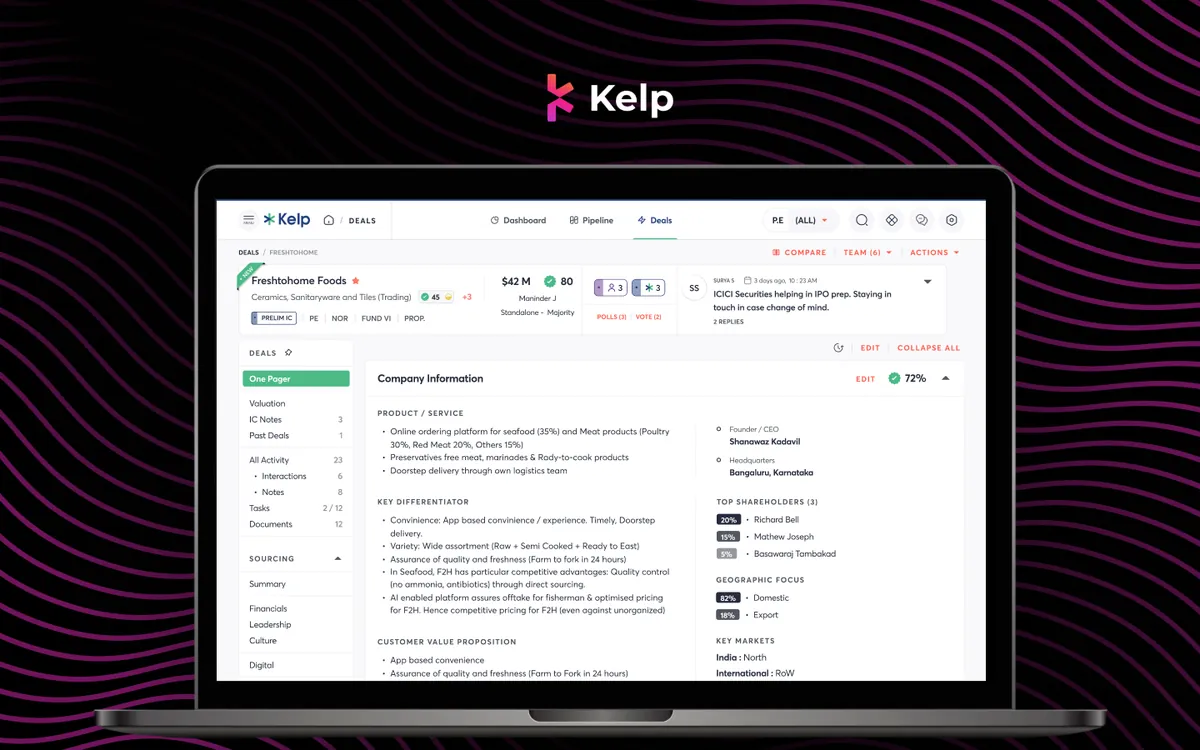
Kelp Global
Deals Module
Every deal's one-pager, IC notes, valuation and documents in one place, with companies compared side by side.
View case studyHave a similar problem?
Tell us what is not working. We'll tell you where we would start, and whether we're the right partner for it.